Chef Tanguy2025, Visual Identity
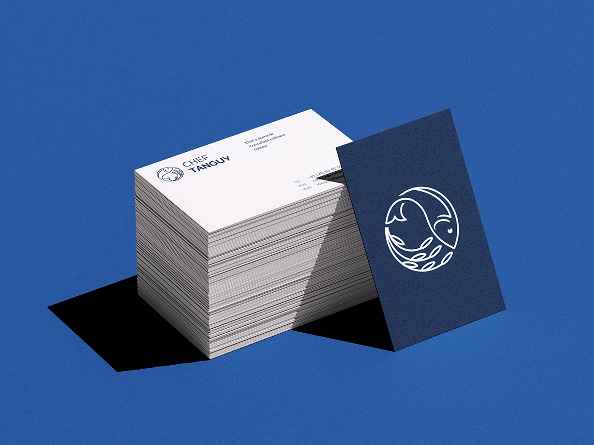
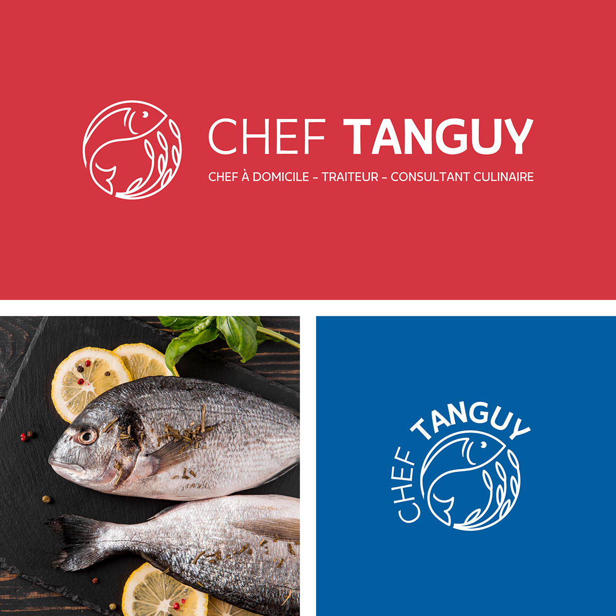
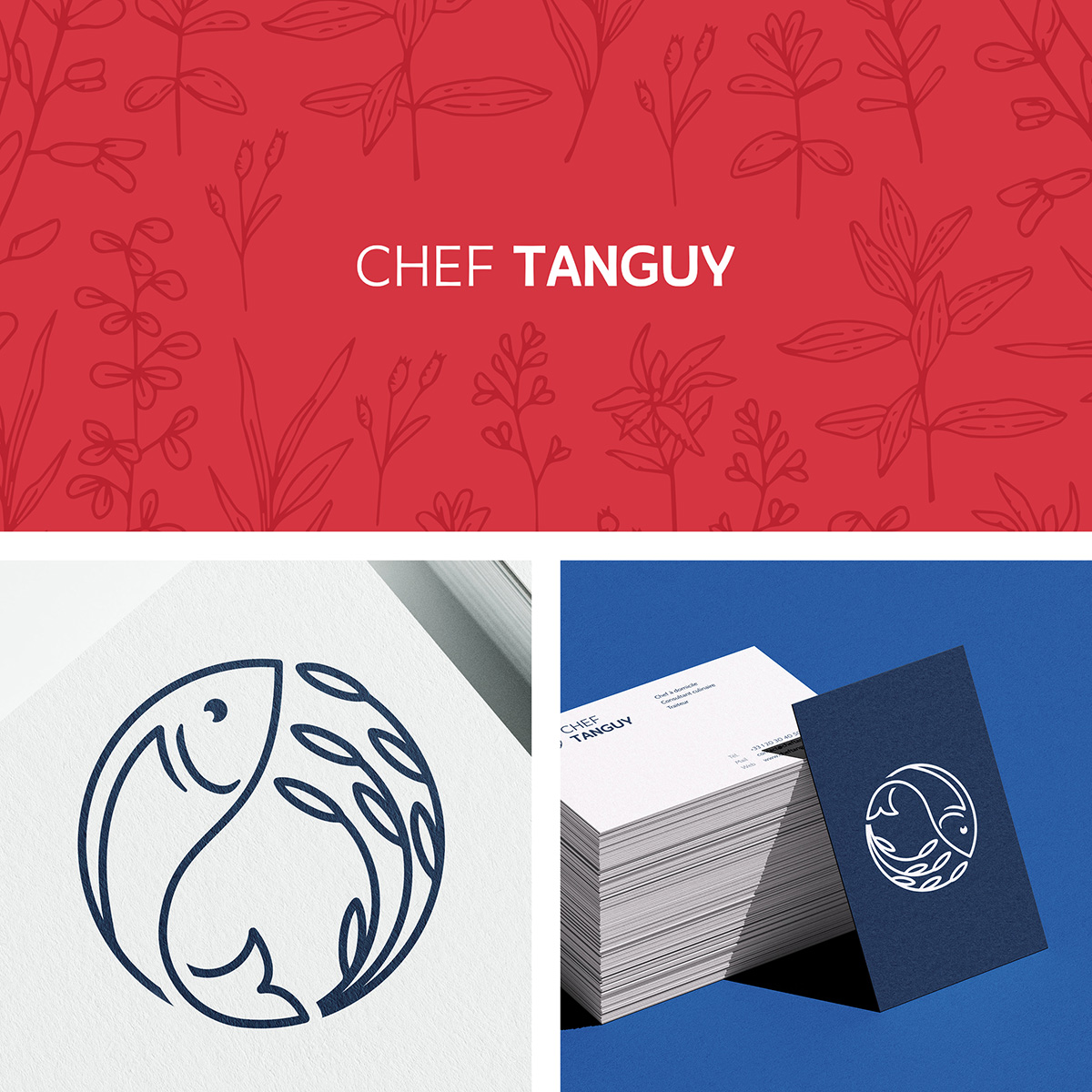
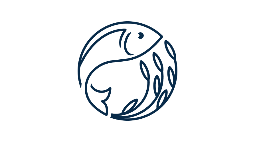
Designed in 2025 for an independent chef, this visual identity is centered around a logo that blends a fish and an aromatic herb. This combination symbolizes the chef’s culinary signature, bridging land and sea. The circular shape of the design subtly evokes a plate, reinforcing the brand’s gastronomic identity.

- #Illustrator
- #Photoshop
- #Typography
- #Colors
- #Logo
Context
The business is built on three complementary pillars: private dining services for a personalized gourmet experience, catering services to enhance the offerings of restaurants and bars, and culinary consulting to optimize menus and processes for professionals.
Constraints and Prerequisites
As a personal visual identity, it must reflect the unique characteristics of the offering. This offering is based on the originality of a menu situated geographically between Paris and the Normandy coast. This geographical positioning naturally translates into a culinary concept of “between land and sea,” symbolized by a plate that brings these two worlds together.
Target Audience
The three services offered cater to a variety of clients, presenting a challenge: balancing the intimate and prestigious nature of in-home service with the operational and logistical aspects of catering and consulting. To address this, I focused my research on a flexible brand identity centered on product quality and provenance—universal values that resonate equally with discerning individuals and professionals alike.
Furthermore, it is important to consider the human element embodied by the chef. The brand’s identity should convey an approachability that allows it to reach a broader customer base, moving beyond the “premium” image that is often perceived as stereotypical.
Research and Inspiration
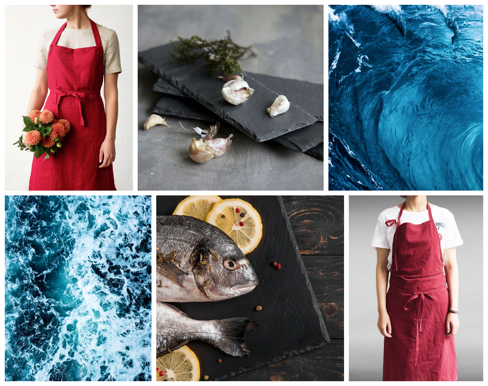
My process began with the creation of several mood boards, exploring the colors and shapes that could best convey this identity visually. After discussing the concept with the chef, I selected the following mood board. It served as an essential foundation for my logo design and guided my color choices.
The Logo
After gathering various sources of inspiration, I began my work with sketches on paper. My research led me to a simple yet effective concept: the combination of a fish and a sprig of herbs. This pairing perfectly captures the “land and sea” theme, which is immediately apparent at first glance.


Choosing The Shape
The rounded shape of the logo evokes a plate, symbolizing the fusion of two culinary worlds into a single dish. This effect is reinforced by the convergence of the fish and herbs toward the upper right corner, creating a sense of harmony. This composition also guides the eye, suggesting an upward movement from left to right, thereby lending it a sense of dynamism.
Typography
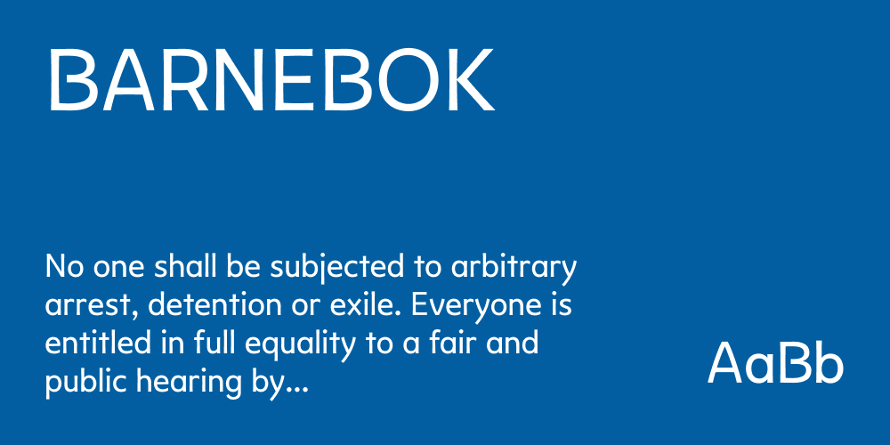
Titles and display
After some research, I chose the Barnebok font, a humanist sans-serif typeface with a slightly flared stroke. This style gives it a modern look while remaining warm, evoking authenticity, local character, and quality. It is a good choice for headlines and body text.
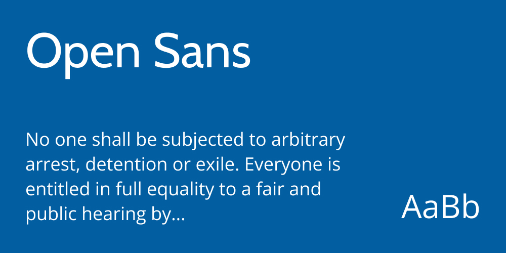
Main Text
To ensure a complementary look, I chose Open Sans. Its more structured style and straight lines convey a sense of professionalism and reliability. This graphic neutrality contrasts with the organic feel of Barnebok, providing a solid, legible foundation for informational content.
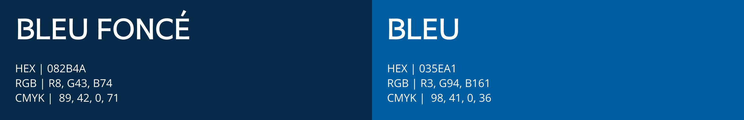
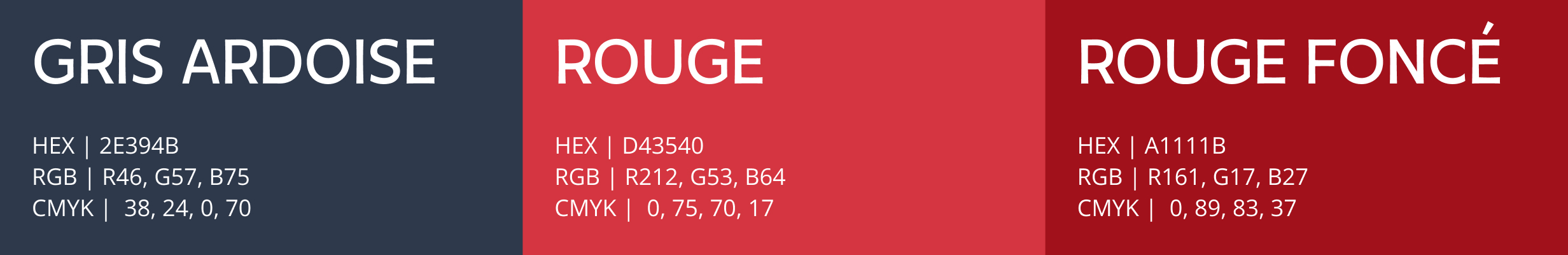
Final Color Palette
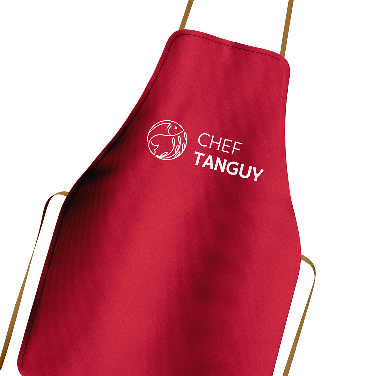
Finally, staying true to the previously approved mood board, I selected three colors, each evoking a distinct aspect of the chef’s world. Blue evokes the “sea” theme of the menu, while also conveying a sense of trust and expertise. Gray, inspired by slate, evokes the “earth” and complements the aesthetic of dishes served on stone, aiming for a premium look. Finally, the red, echoing the chef’s apron, would place him at the heart of the visual identity and provide a necessary touch of contrast.