Coopart2023, Web Platform
- #Illustrator
- #Photoshop
- #InDesign
- #After Effects
- #Video
- #Figma
- #Visual Identity
- #Logo
- #Typography
- #Colors
- #Team work
- #Fictional project
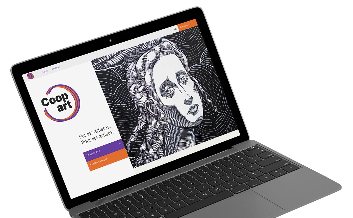
Coopart is a fictional web platform dedicated to a fair art market. It empowers artists by providing them with visibility and compensation through the use of Blockchain technology.
As for my role, I actively contributed to the various analyses on the subject, user research, and the definition of interfaces. I also took charge of creating the presentation video (in french).
Context
This project was originally carried out by a team of 5 people in 2023 as part of the Master's degree in Digital Creation and Publishing at the University of Paris 8. The assigned theme was the Blockchain technology applied to the Social and Solidarity Economy (SSE). We were the ones who proposed this concept.
Problematic
Beginning artists face major challenges: getting their work known, monetizing it, and understanding their rights. Often, they have to go through intermediaries, such as curators, to gain visibility in galleries, but these intermediaries take a significant share of the profits. Additionally, access to these networks is often limited for those from less privileged backgrounds.
Blockchain's Advantages
Smart contracts based on blockchain technology offer a solution by guaranteeing the authenticity of artworks and protecting the rights of artists. These automated contracts secure transactions and prove the ownership of the works, while ensuring that artists benefit from resale royalties without relying on intermediaries.
Research
Desk Researches
We began with an in-depth research phase to understand the functioning of Blockchain technology as well as the art market. We analyzed both fields from technological, economic, legal, and socio-political perspectives.
Finally, we conducted a simultaneous benchmark to analyze existing solutions and identify ongoing issues.
Interview Phase
To better understand the needs of our target audience, we conducted a series of interviews with artists from various backgrounds. We interviewed a visual artist, a performance artist, a photographer, a student videographer, a musician, and a visual artist.
Following these interviews, we realized that the initially envisioned solution did not address the defined problem at all. As a result, we completely redirected the project, which evolved into what was presented earlier.
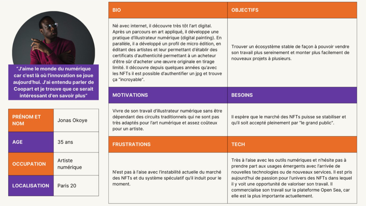
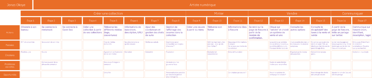
Personas and User Journeys
We then divided our target audience into 3 main profiles corresponding to Coopart's targets: artists, buyers, and curators.
The first group wants to join Coopart to increase the visibility of their art, the second group aims to enrich their digital art collections, and the third group seeks to expand their network and discover new promises in contemporary art.
Below is an example of a persona with their user journey for the artist profile on the platform.
Design
Visual Identity
In the early stages of the project, we proposed two different visual universes: one more tech-oriented, with flashy colors on a black background and sharp contrasts; a second, inspired by the 70s, with references to collage techniques.
After discussion, we decided to keep the 70s inspiration, while streamlining and simplifying the color palette.
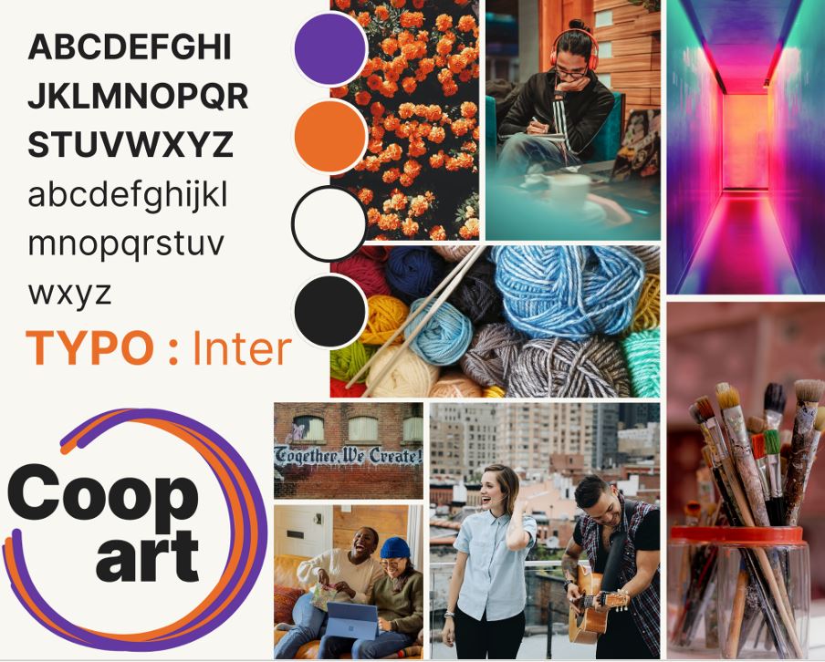
Here is the result of our graphic research. We chose the "Inter" font, which is simple, modern, and elegant. The colors, inspired by our 70s visual identity, are sufficiently contrasted to ensure excellent readability and ease of understanding.
The logo features the image of a ball of yarn, as it can symbolize the union of multiple entities with a common goal, creating something new while maintaining their individuality.
Wireframes and Structure
The design of our prototype began with sketching the pages and functionalities of the website, with the goal of defining an optimal structure.
We then created an initial zoning, which quickly evolved into medium-fidelity wireframes. This prototype was tested by several people outside the project, which allowed us to refine and improve it throughout its development.
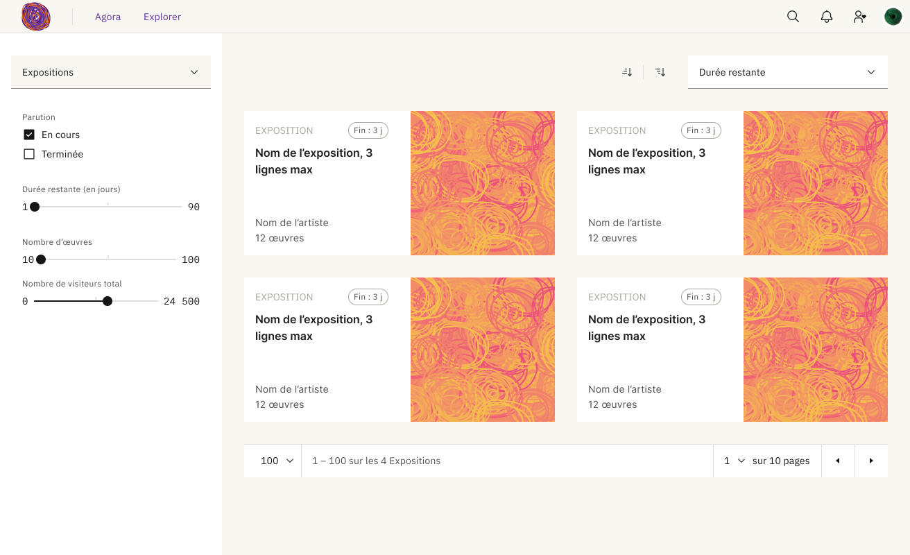
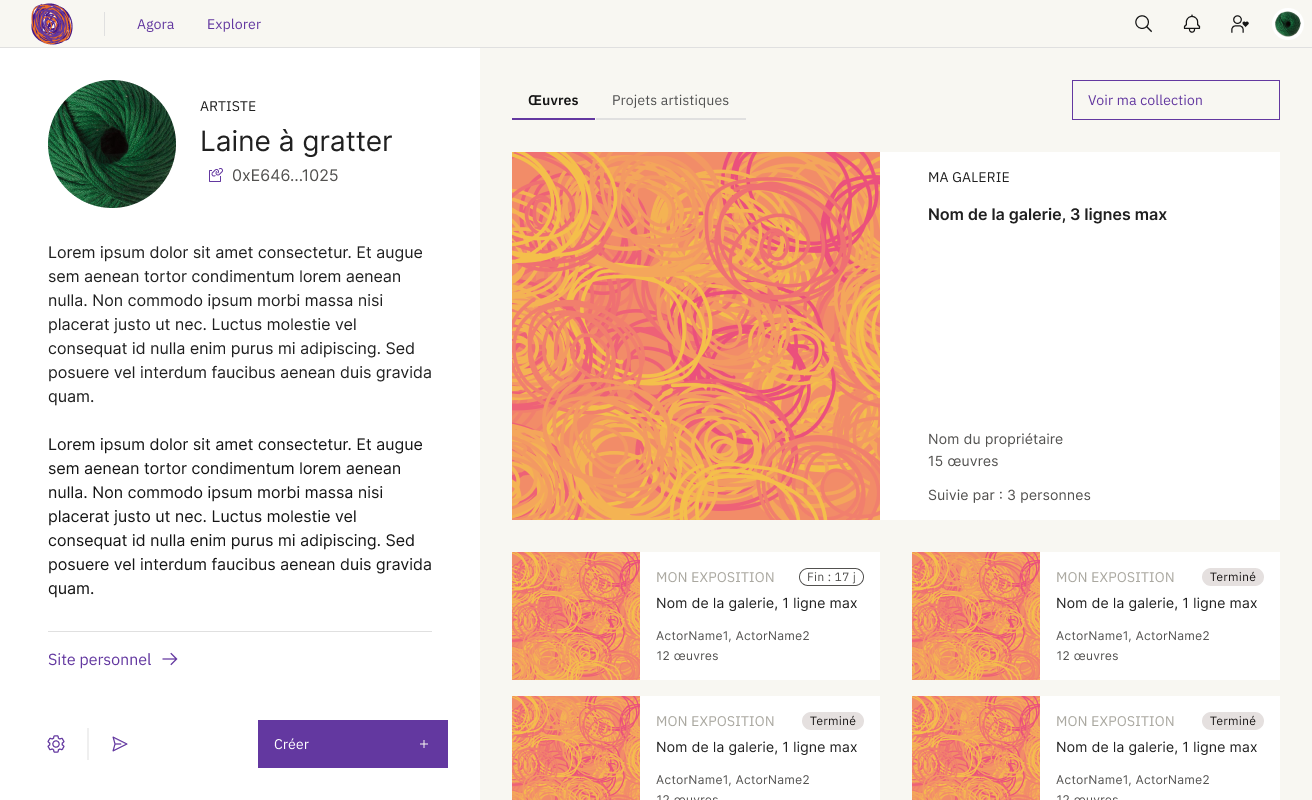
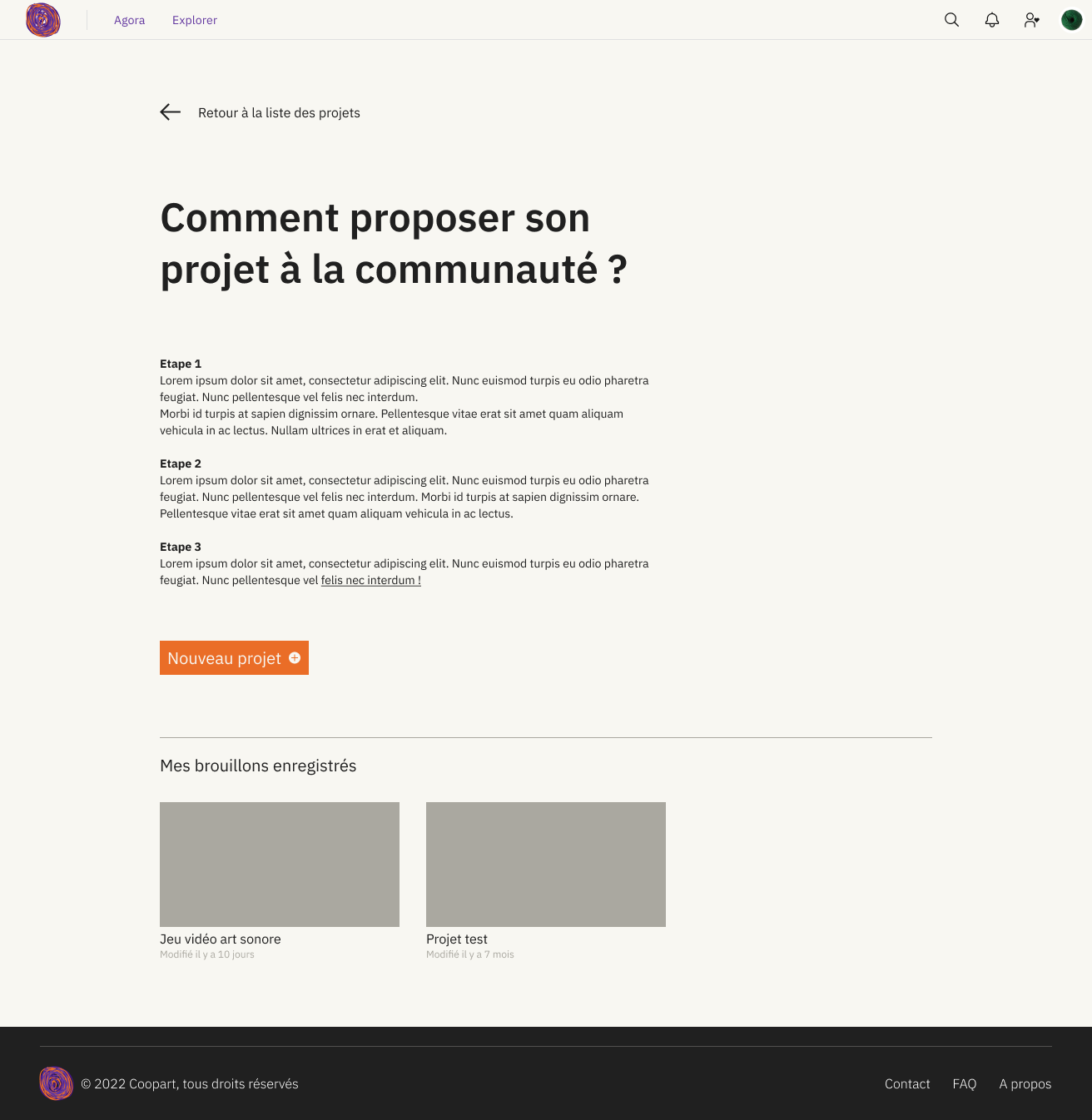
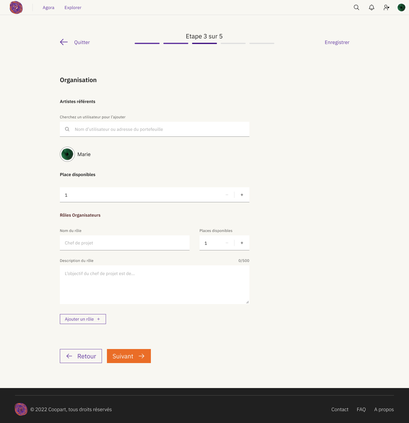
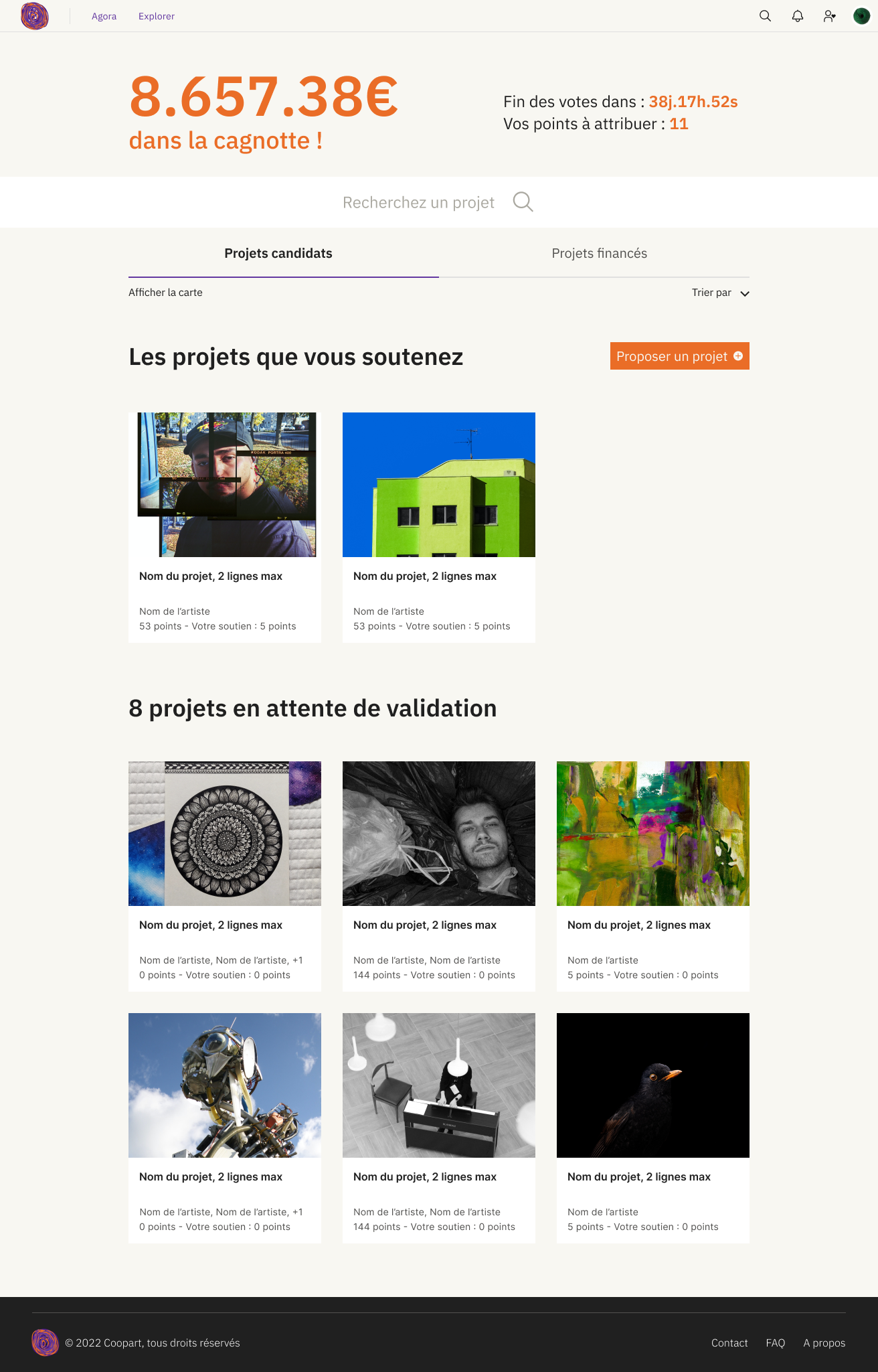
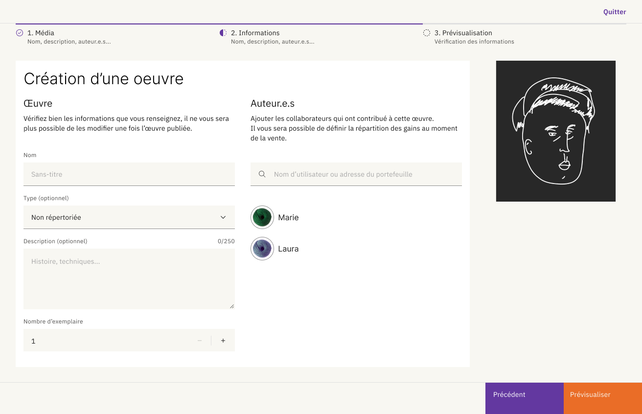
Final Interfaces
The final interfaces were then created and compiled on Figma. Here are a few of them.
Presentation Video
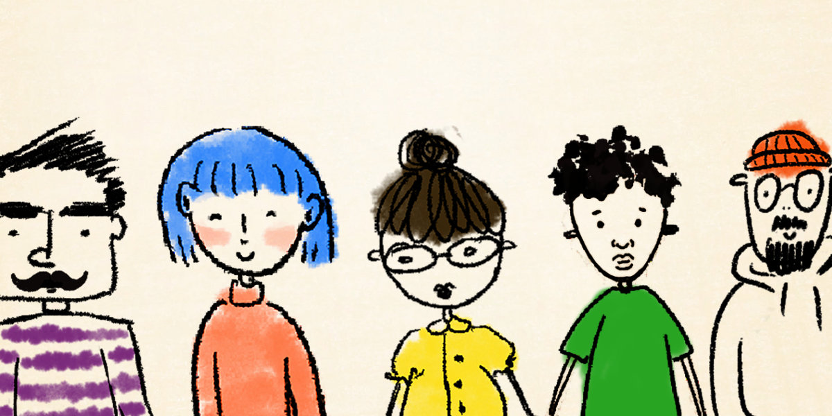
This video highlights the main features of the platform. We wanted to emphasize its overall solution, so we chose to omit interfaces in favor of a design aesthetic based on drawings and collages. Most of the illustrations were created by us.
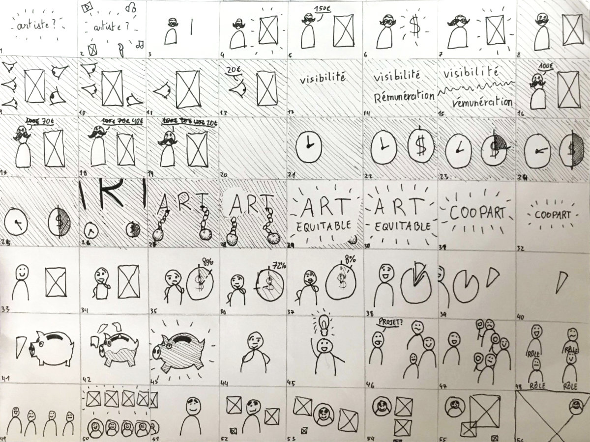
First, I designed a storyboard to organize my ideas visually.
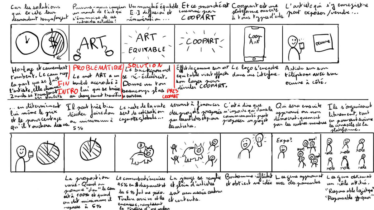
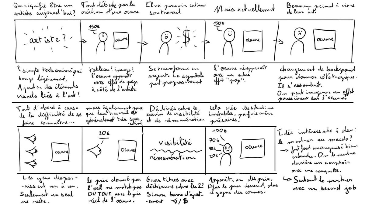
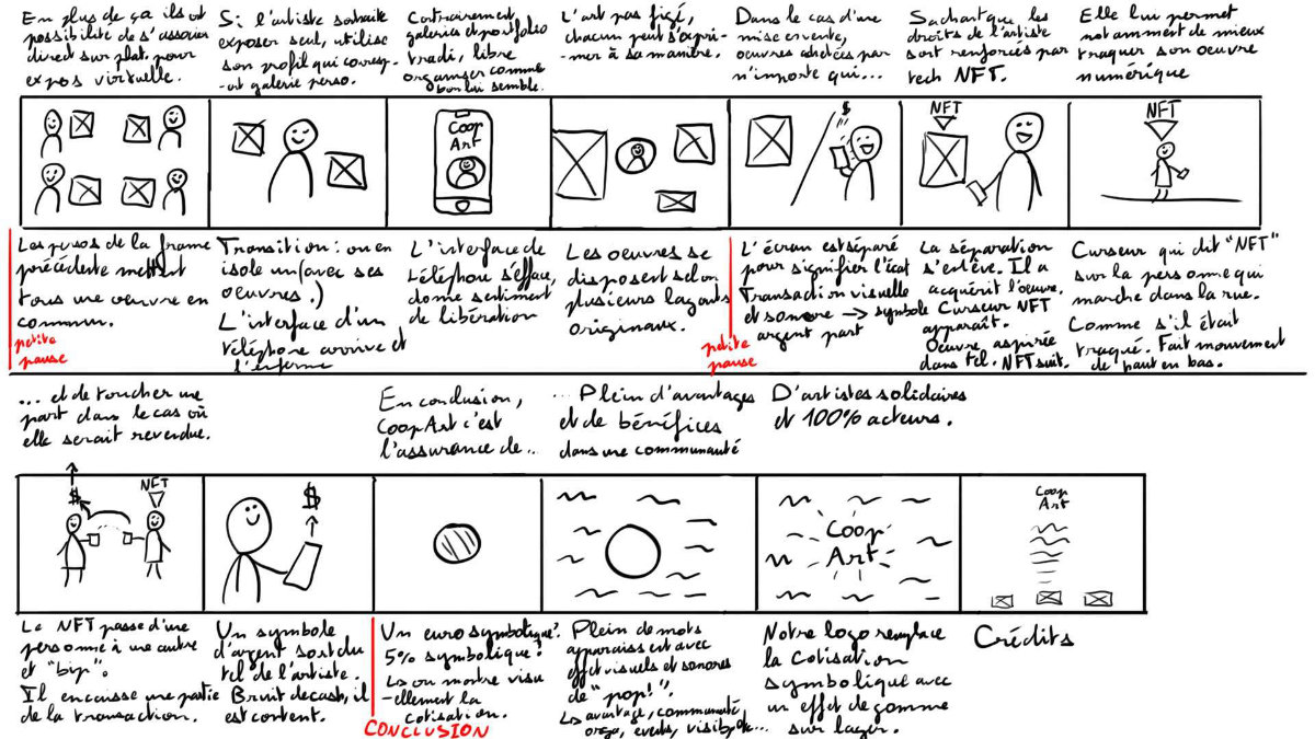
This storyboard was then reimagined based on feedback from my colleagues and professors.
Retrospective
As an area for improvement, I would point out the logo, which is not well-suited to the modern branding challenges. Since the logotype cannot be separated from the logomark, the logo loses any possibility of responsiveness.
Its concept, derived from the image of a ball of yarn, is interesting but might not be visible enough or may not be well-exploited: it’s hard to understand without the context.
We can also question its style. Although it attempts to convey an artistic dimension, the hand-drawn circles don’t contribute effectively: they give it more of an amateur feel than a professional one.
The visual identity as a whole is effective, but not detailed enough in terms of documentation. A complete style guide would be beneficial. However, it is more than sufficient for a student project.
Overall, Coopart is a very high-quality project. We were able to provide thorough documentary research, user research, a benchmark, and a multitude of solid tests.