Design Challenge2024, Design System
- #Figma
- #UI/UX
- #Fictional Project
- #Individual work
- #Colors
- #Typography
- #Design tokens
- #Guidelines
- #Specifications
- #Components
This project is a design challenge/exercise with the goal of creating a system design file containing two components: buttons and cards, accompanied by detailed documentation.
I was able to discuss accessibility standards, the importance of design tokens as well as the challenges of clear and effective documentation for optimal communication with technical teams. It was a very interesting case study that allowed me to develop my skills in UX/UI analysis and my modular design logic.
You can access the original files on figma by clicking here
Or download the PDF of these files (5MB) by clicking here
Defining the Styles
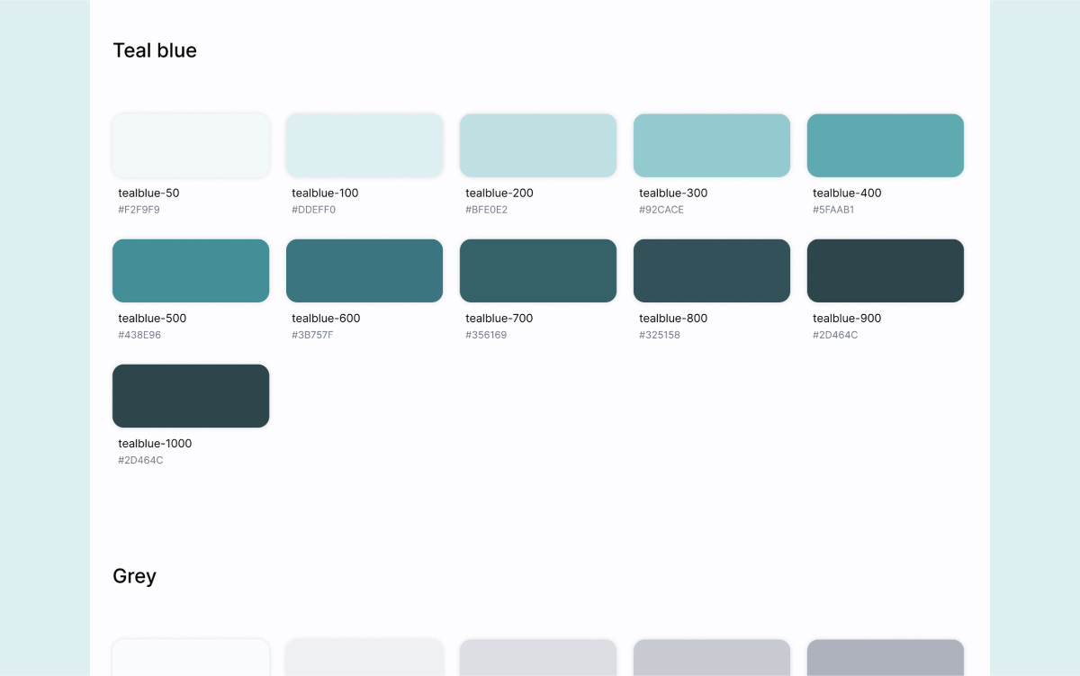
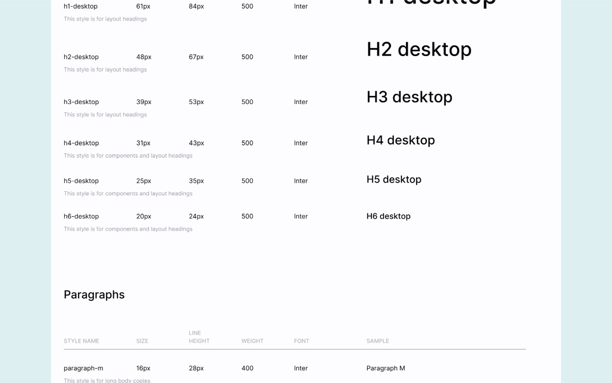
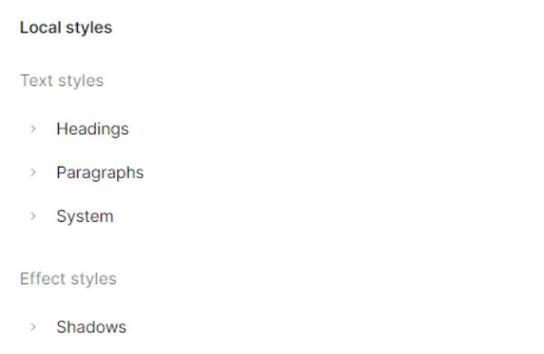
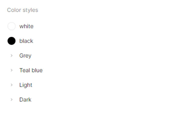
Before diving in, I wanted to define all the basic and necessary elements for building components, so I wouldn’t have to redefine them halfway through the work and disrupt my thought process. These elements are what we call styles, and they help maintain consistency within the design system. I therefore defined colors, a typographic system, shadows, and icons.
Integration on Figma
These styles were then saved in the Figma file as "styles" (variables with the same name). Only the icons are an exception, as they were integrated as reusable components for future use.
Creating Components
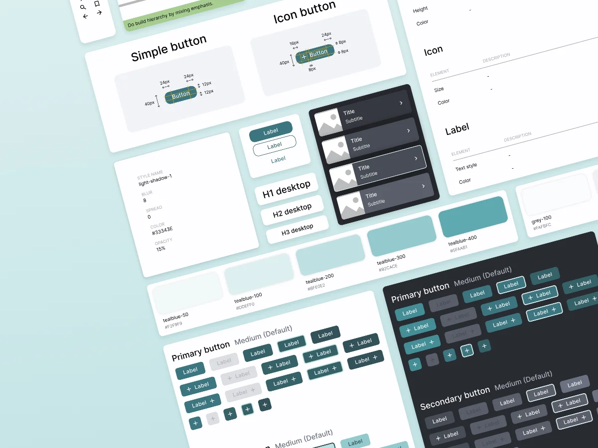
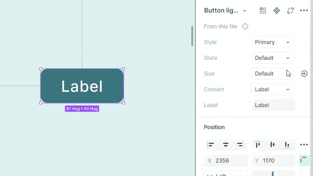
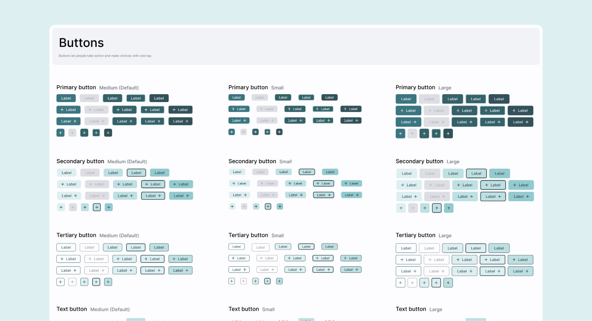
Buttons
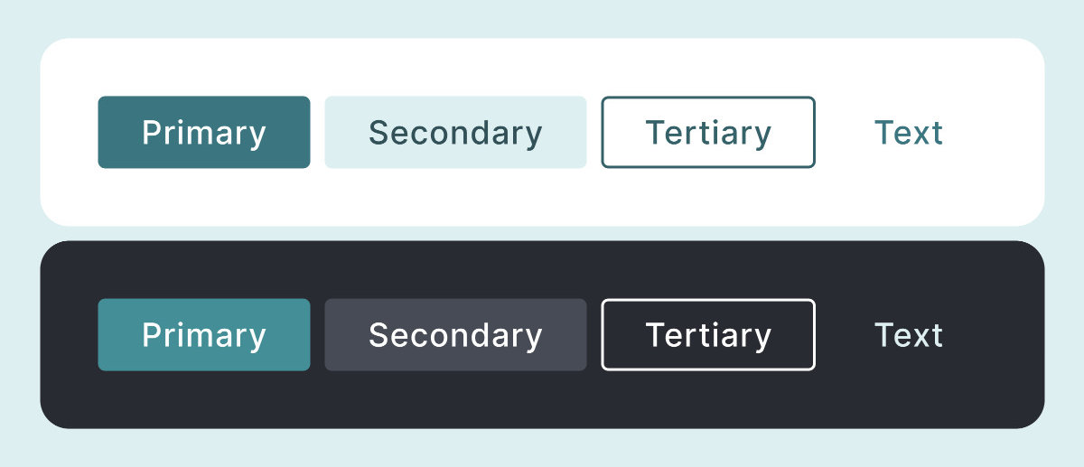
Simple in appearance, buttons are complex in their construction. I took into account many variables when creating them:
- Hierarchy: primary, secondary, tertiary, text
- State: active, inactive, hovered, focused, pressed
- Size: small, medium, large
- Content: text, text with an icon on the right, text with an icon on the left, just an icon
- Label (if there is one)
Cards
I created two versions of the cards: a vertical one, optimal for large screens, and a horizontal one, optimal for smaller screens. Since I primarily focused on the study of buttons, their structural variables are more limited:
- Style: filled, elevated, outlined
- State: active, inactive, hovered, focused, pressed


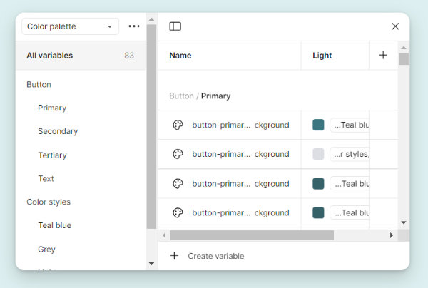
Linking with Design Tokens
To streamline the association of styles with components, I then created design tokens using Figma’s variable feature. Each value, initially stored in a style, was then assigned to a component’s attribute. This approach helps standardize styles and makes updates easier, as any changes will automatically reflect wherever the modified element is used.


Modes and Contrast
Finally, there are two versions of each component: one for light mode and another for dark mode. When selecting the colors, I made sure that the most important buttons (primary, tertiary, and text) have optimal contrast, ensuring they meet at least the AA standard.
Guidelines
Guidelines are a set of rules and recommendations aimed at ensuring the consistency, compliance, and quality of elements within a system. In our case, I wrote the button guidelines.
They are divided into 4 major sections: format, container, content, and usage. Each section addresses specific cases illustrated with concrete examples.

Specifications
This document thoroughly lists all the technical parameters for the button. In the case of working with a development team, this is the type of file that needs to be as clear as possible. That’s why I kept it very simple, giving it a raw and technical appearance.

Retrospective
It is a very complete and high-quality piece of work. Relying on Google’s design system, Material Design 3, for its creation, this influence is reflected in the quality of the result. However, I can offer two suggestions for improvement.
First, the cards could have had more variables. It would have been possible to dynamically include additional elements, such as prices, other lines of text, or even a header.
Second, the specification document is quite heavy to read. The value associated with an element is too far from it. To improve readability, I could have structured it in table rows to guide the eye.