Afterwork!2022-23, A4 Posters
- #Illustrator
- #Photoshop
- #Typography
- #Colors
- #Individual work
These posters were created as part of the organization of Afterworks (a convivial evening with colleagues) for the employees of GlobeSailor, where I worked as a graphic designer. They were published internally, and are all based on a humorous principle with a few references to the specific corporate culture of its employees.
Requirements
With over 7 languages spoken in the same office, all posters had to be in English. Of course, it was necessary to mention the name/type of the afterwork, the date, and sometimes the time. In addition, the company no longer wanted to finance alcohol, so I had to add the “Bring your own booze” mention.
Board Games Night
First poster of the serie, I decided to make it in an abstract geometric style. The large illustration is composed of different visual shapes from the most famous board games (at least in France). For example, we can find Monopoly houses, the 4 colors of Uno, or a Jenga tower.
The second version is more targeted at employees with a card from the game Cards Against Humanity. Employees are invited to complete it, as in the original game.


Retrospective
I find the first version more aesthetic and refined, especially thanks to the negative space that goes better with the geometric shapes. On the other hand, the concept of inviting employees to participate spontaneously worked rather well in promoting the event.
The only negative point is that the date format is American. I was biased when it was created by thinking that all English speakers used this format, which is wrong; only Americans use it. This created a slight confusion, thank goodness there is no 22nd month!
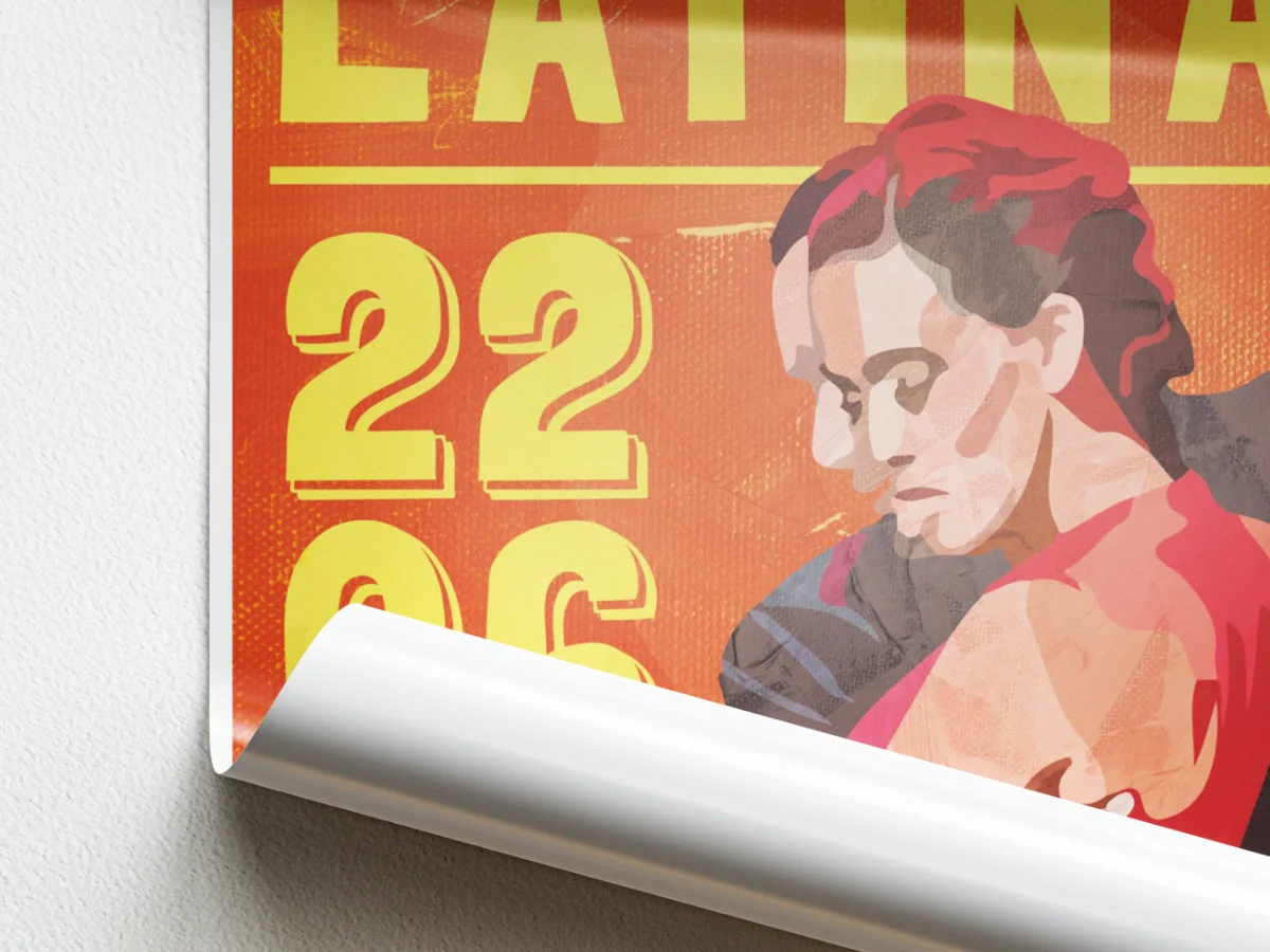
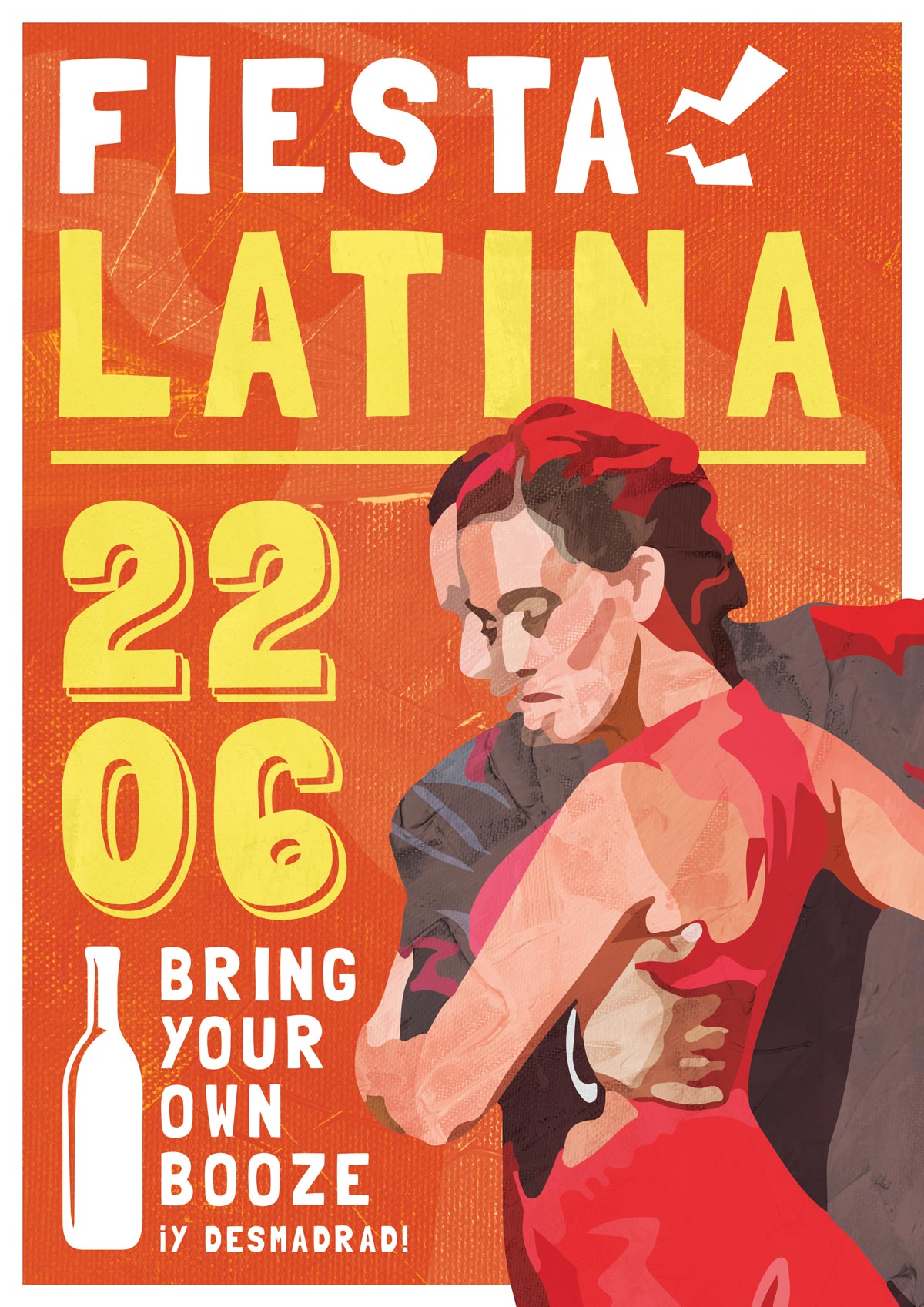
Fiesta Latina
I mainly wanted to create a dynamic and lively atmosphere, in keeping with the imagery of Latin America. I therefore went with warm tones, popular typography, and a strong emblem of this festive culture: dance. The illustrated characters are Bachata dancers.
As a nod to the Spanish-speaking market, I added the word “desmadrad” which means “to move away from one's mother” in the sense of letting oneself go and losing control. This detail made more than one person smile.
Retrospective
We can notice the lack of empty space between the elements that makes them feel tight to each other. Maybe we could imagine a version that breathes a little more? The mention "Bring your own booze" does not need to be so big.
Be careful with the contrast between the yellow letters and the orange background. For such a large text, it is passable, but we could have gained in accessibility by improving it. The afterwork was still a success.
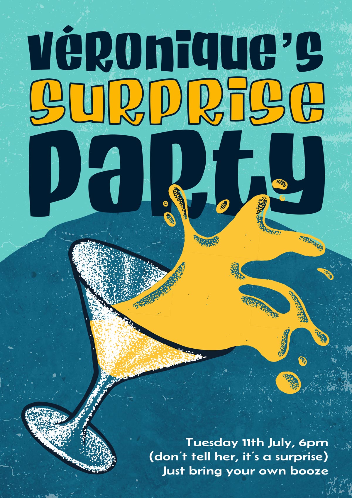
Véronique's Surprise Party
This poster is a joke: to make a surprise event for Veronique, a long-time employee, by pretending she didn't know. So I took her color and her favorite drink.
Retrospective
Unfortunately, not all employees understood the joke. The second degree behind this poster corresponds to a certain type of humor that is too specific. Véronique, on the other hand, was very happy.
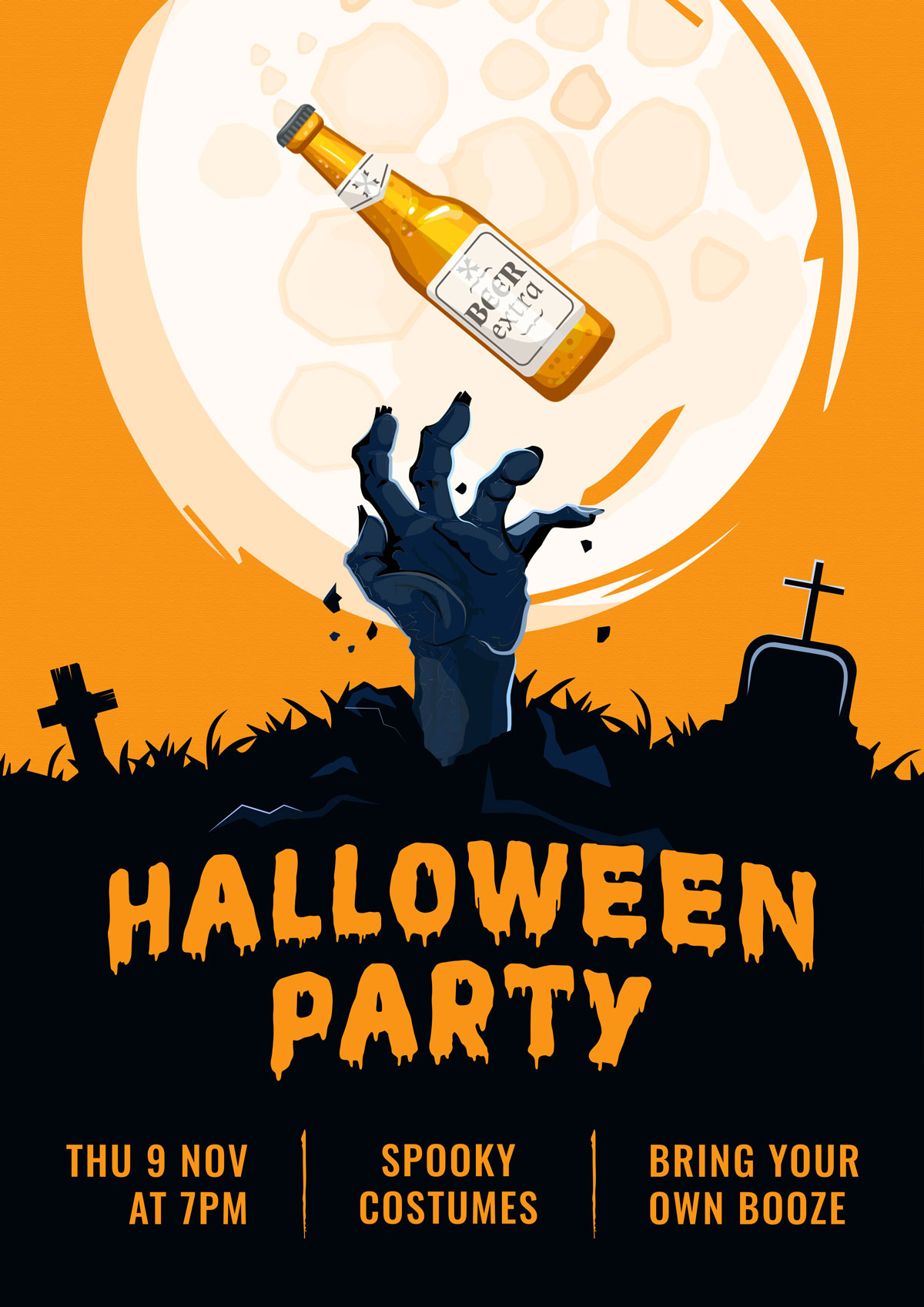
Halloween Party
The dead come back to life to party... and drink beer! That's the whole humorous concept of this poster. I made it in the traditional Halloween colors, black and orange.
Retrospective
The black/orange contrast works very well, the idea is clear, the information simple.