Tupinamba2024, Flyers
- #Illustrator
- #Photoshop
- #InDesign
- #Typography
- #Colors
- #Mockup
- #Web
- #Individual work
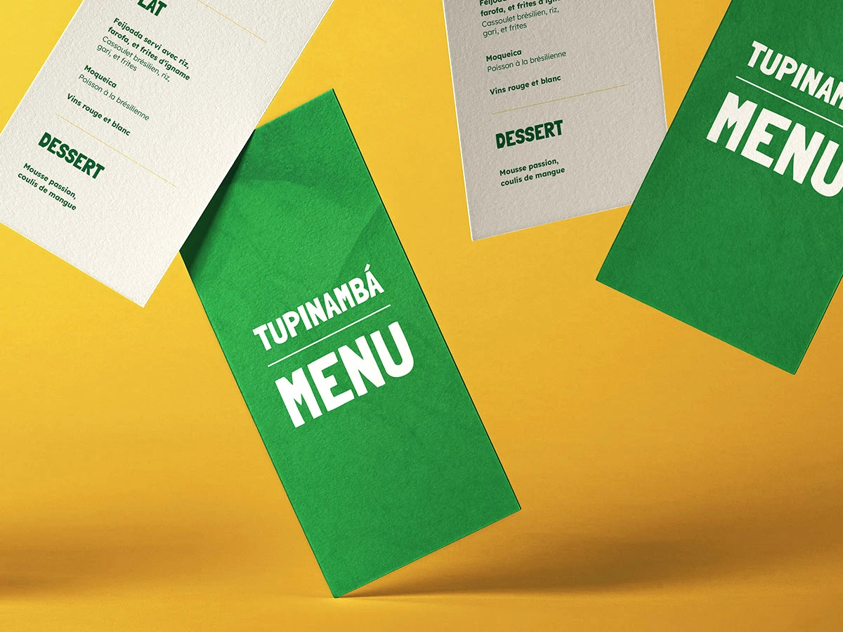
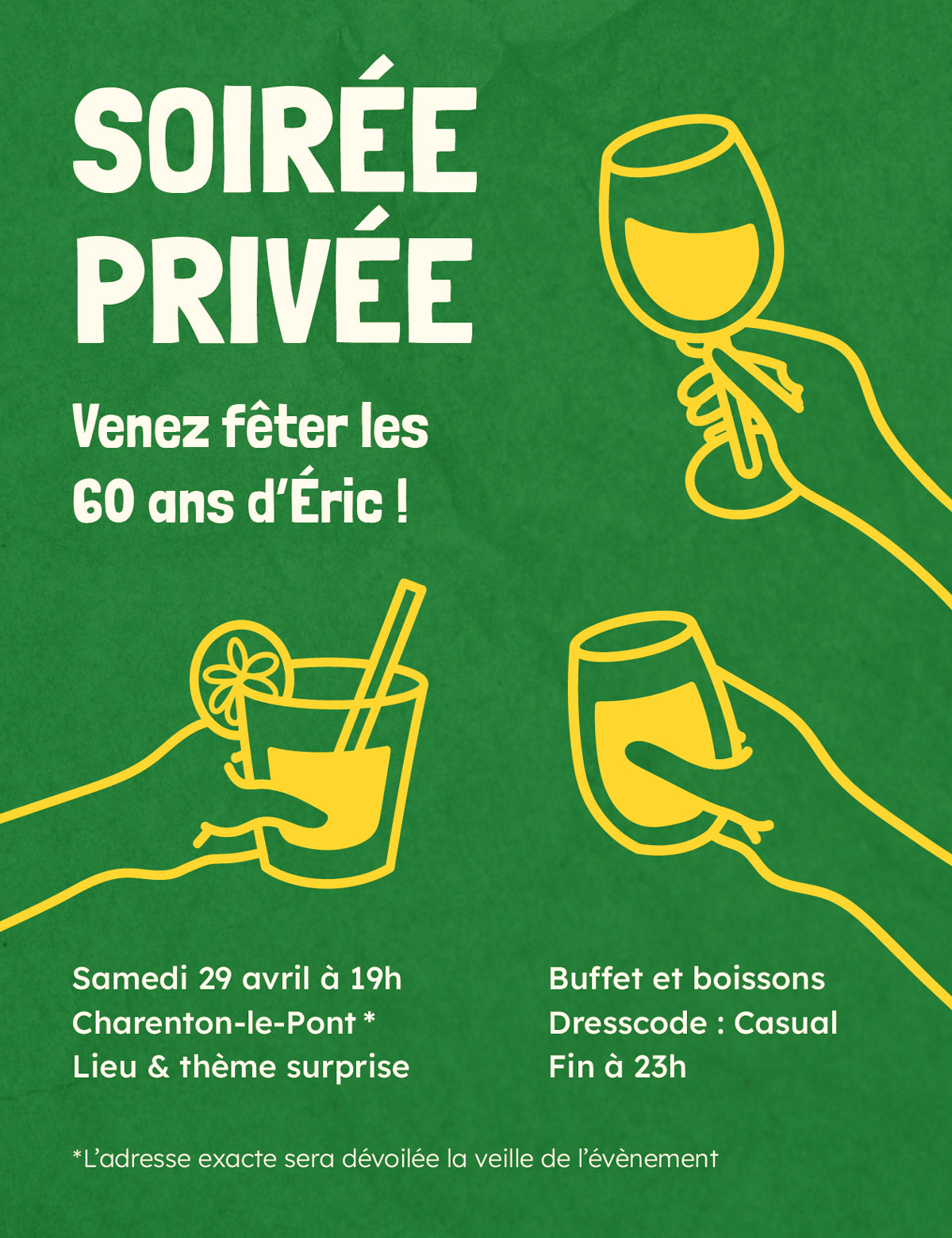
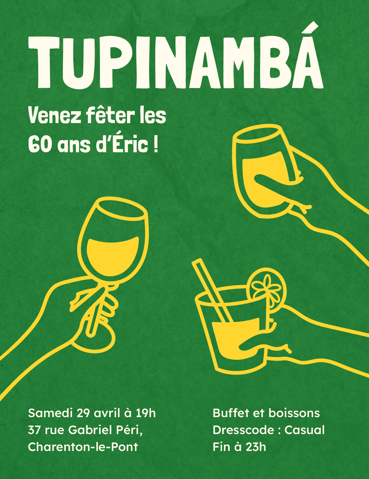
In the context of a private birthday party, I made two flyers: an invitation card and a menu. Tupinamba is the name of the restaurant that hosted the event, it comes from a Native American tribe in Brazil.
Context
Surprise Theme
At the client's request, the theme of Brazil and therefore the location of the restaurant had to remain a surprise until the last moment. Thus, the invitation card exists in two versions: the first censored with the implicit theme and the limited address, and the second more explicit with the theme assumed in the title and the exact address.
Requirements and Constraints
Since this project is not oriented in a marketing context, it is less relevant to talk about specific targets. Especially since the visuals are aimed at the client's family, which includes people of all ages and socio-economic backgrounds.
At the client's request, the colors had to be both inspired by pan-African hues and faithfully reflect those of Brazil. Originally from West Africa, he wanted the design to embody his identity while keeping an element of surprise for the end: the first version of the invitation evokes his origins, while the second reveals the real theme.
Graphic Choices
Aesthetic
How to describe this event? Familiar, warm, exotic, tasty, and colorful. These are so many adjectives that I tried to convey in the different visual aspects.
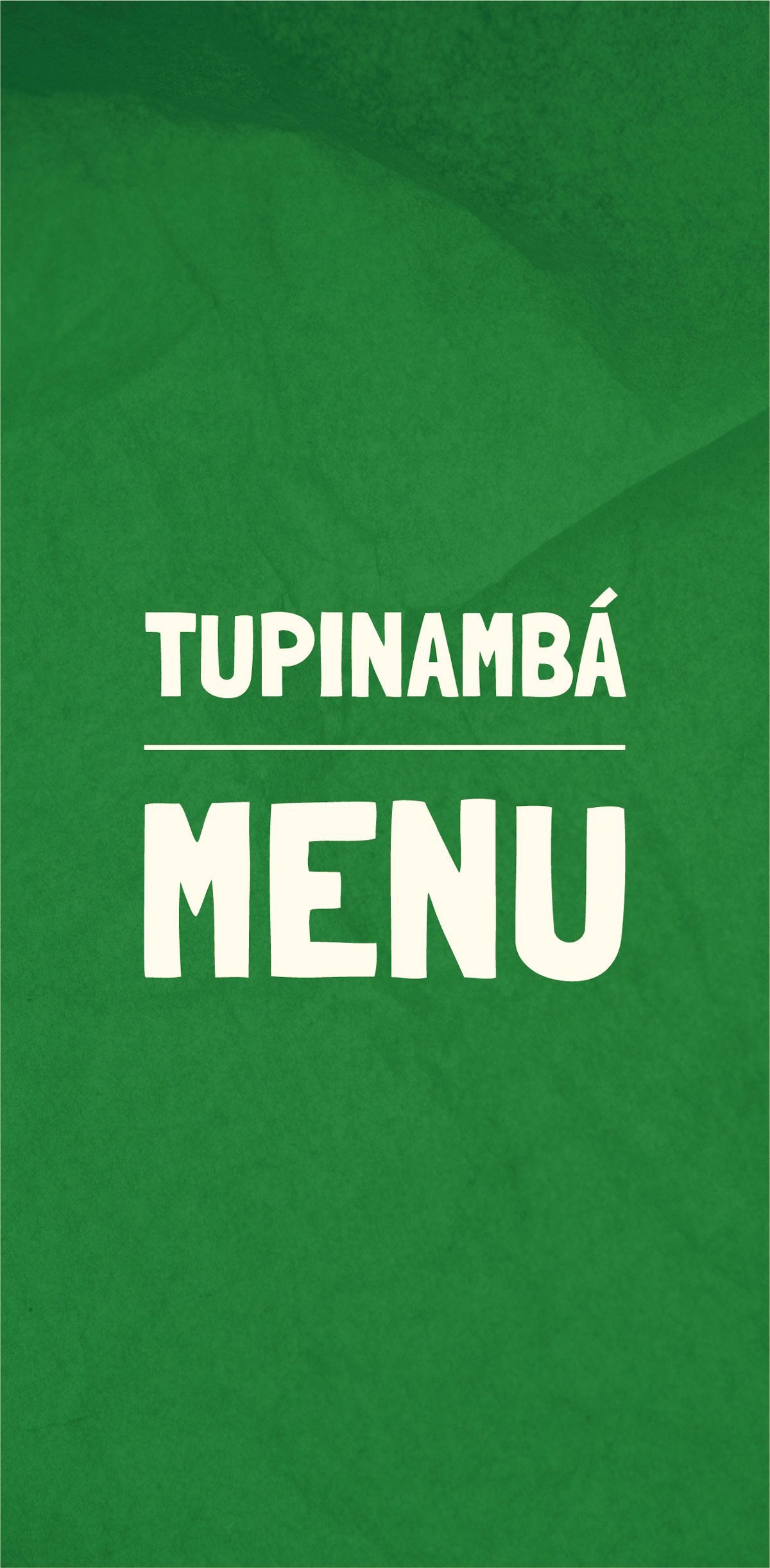
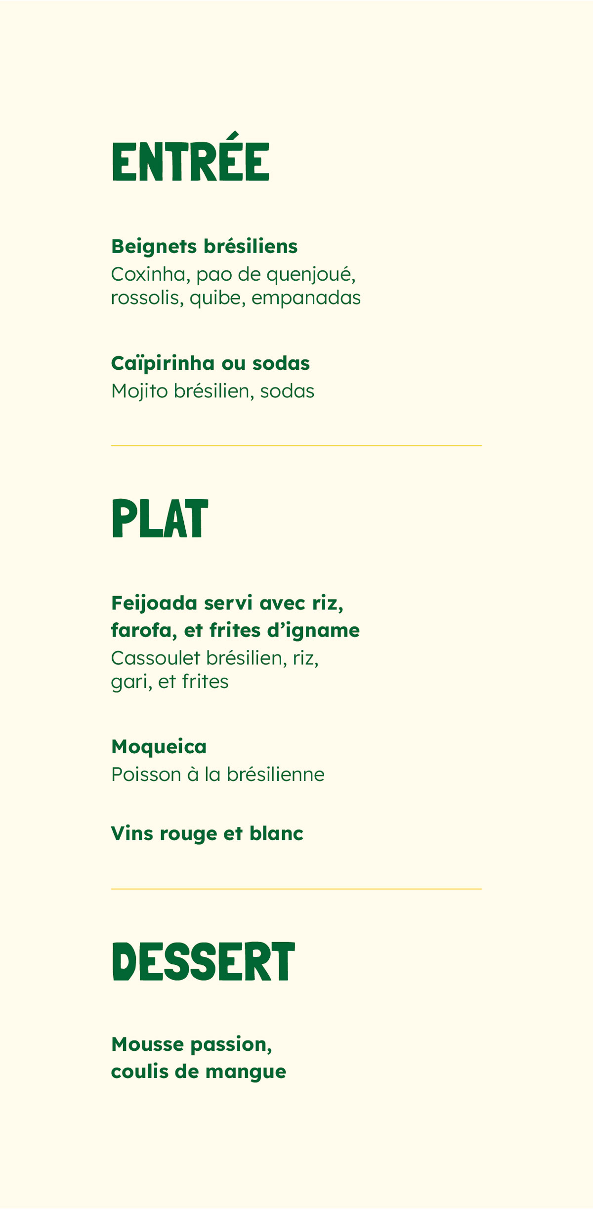
Thus, I opted for a board with a fully colored background. This green gives a more vibrant appeal to the whole while representing the tropical environment of the Tupinamba. The addition of a texture also reinforces its authentic aspect, as does the use of these stylized illustrations that give it a handcrafted side.
Finally, all these attractions are also expressed through the typography of the titles with its popular handmade side.
Retrospective
My only comment concerns the illustrations. To maintain visual coherence, the menu could also have benefited from a few illustrations, particularly to give an overview of the different dishes.
However, their minimalist style only partially harmonizes with the overall aesthetic defined by the typography and colors. Having produced these illustrations myself, my limited skills in this area prevented me from applying a more appropriate style. However, I'm determined to improve my illustration skills for future projects.
Overall, the project is quite successful. The texts are well structured, there are no contrast problems, and the information is clear. The art direction was able to respond to the concept requested by the customer, who was more than satisfied.