Literatura2024, Visual Identity
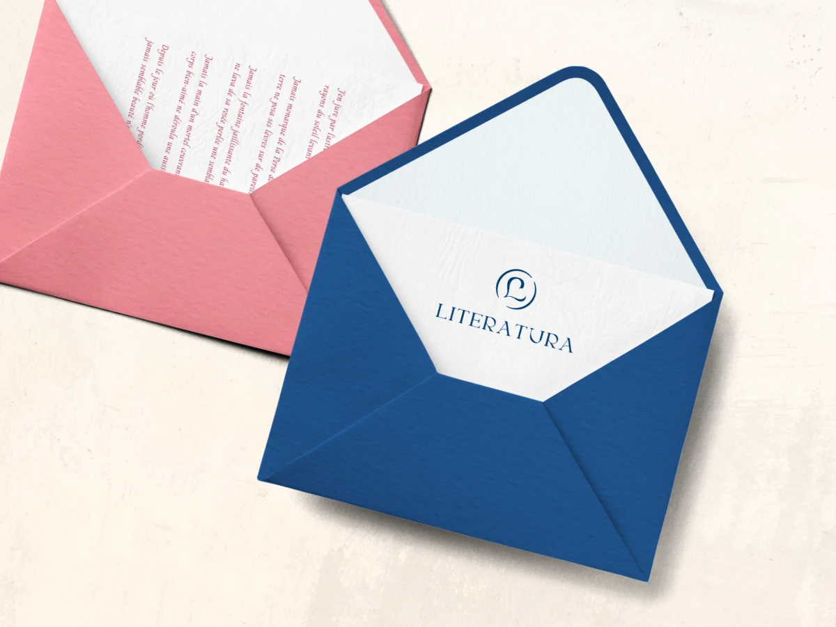
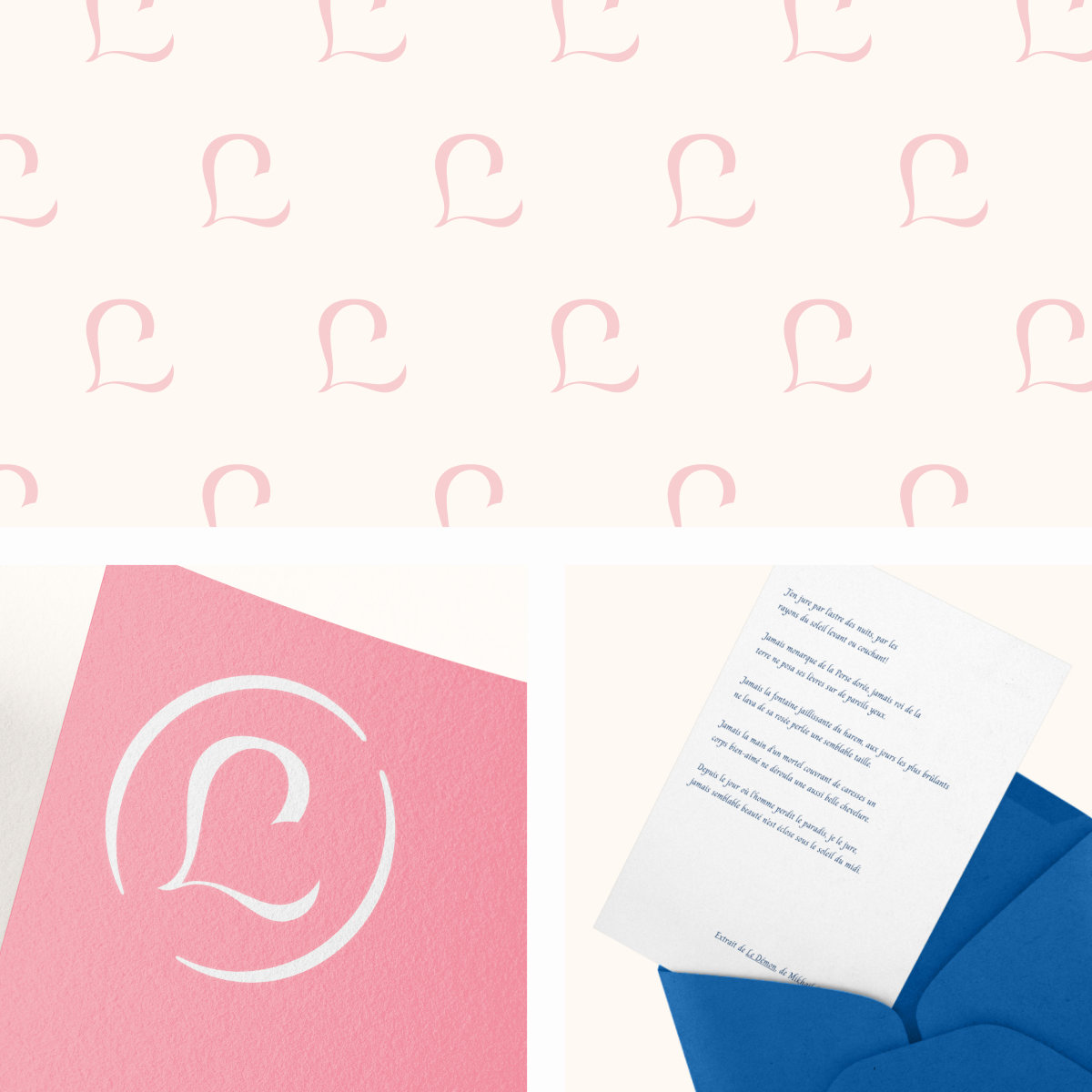
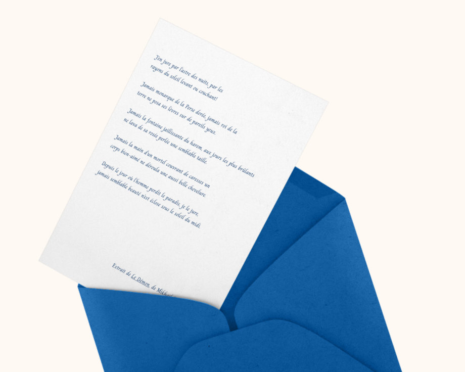
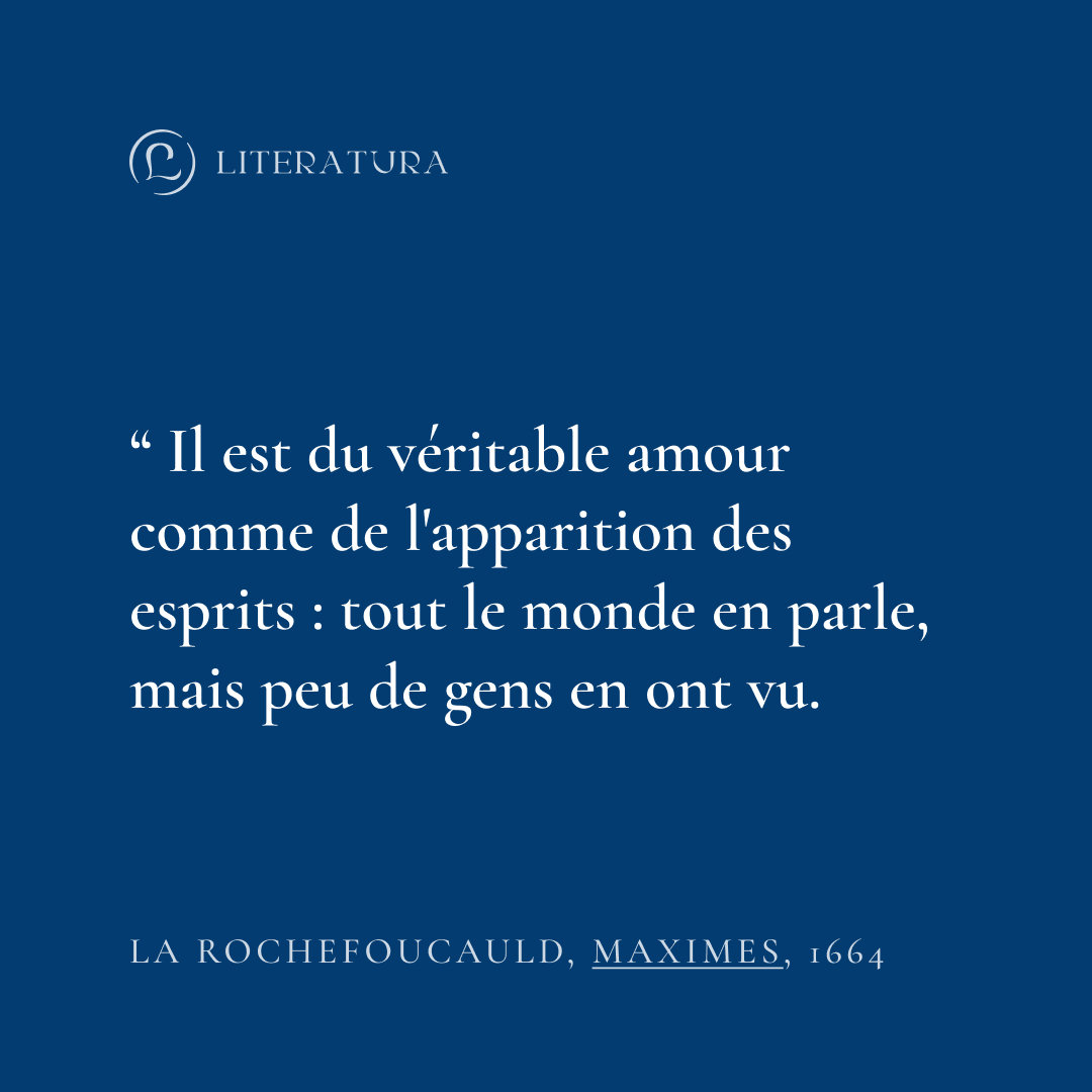
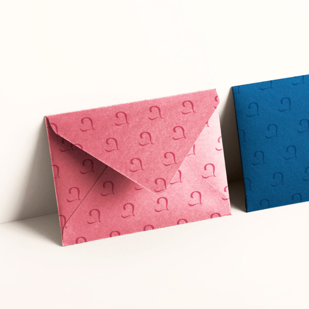
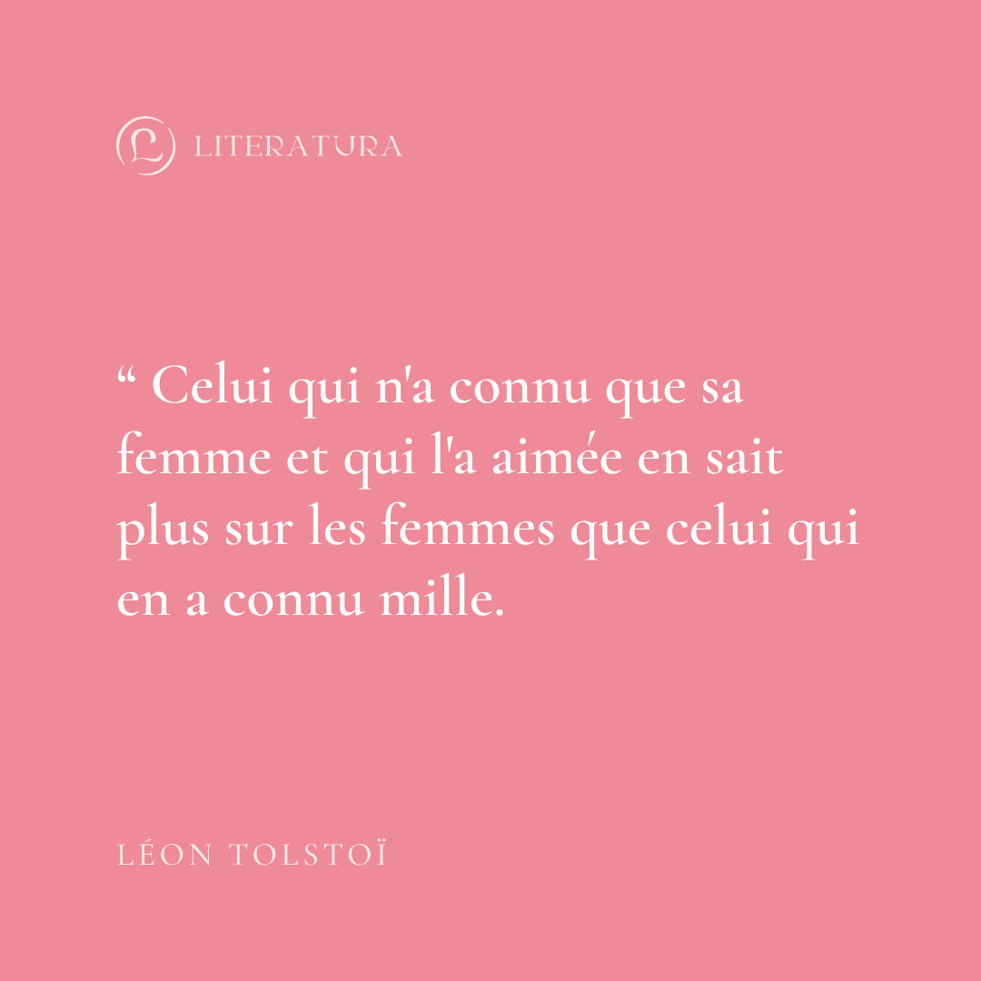
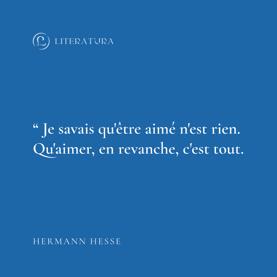
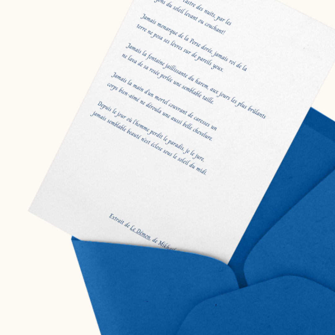
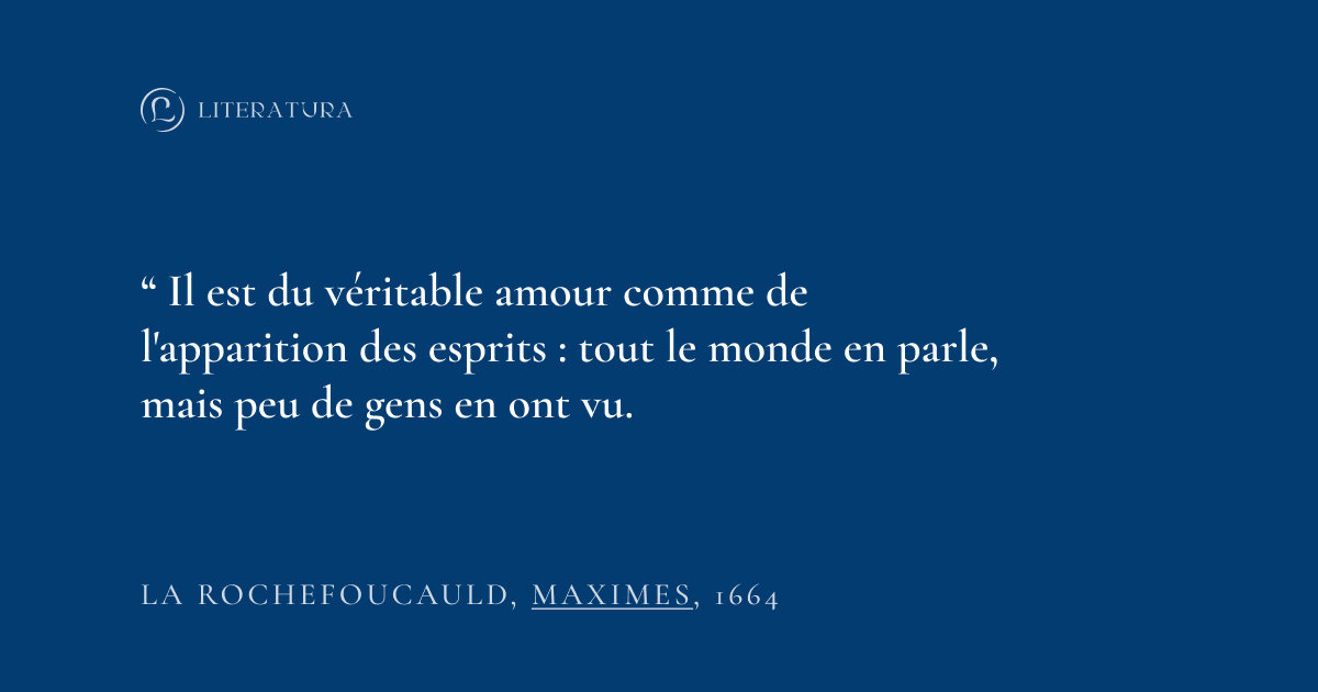
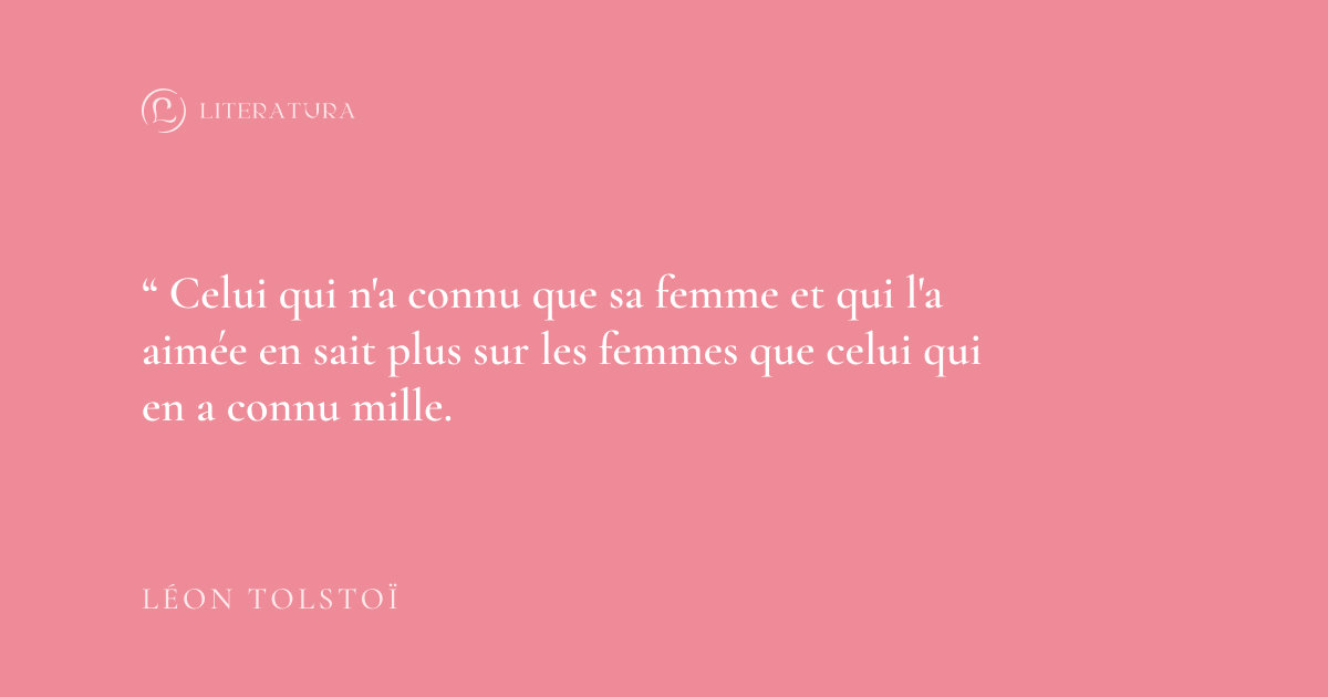
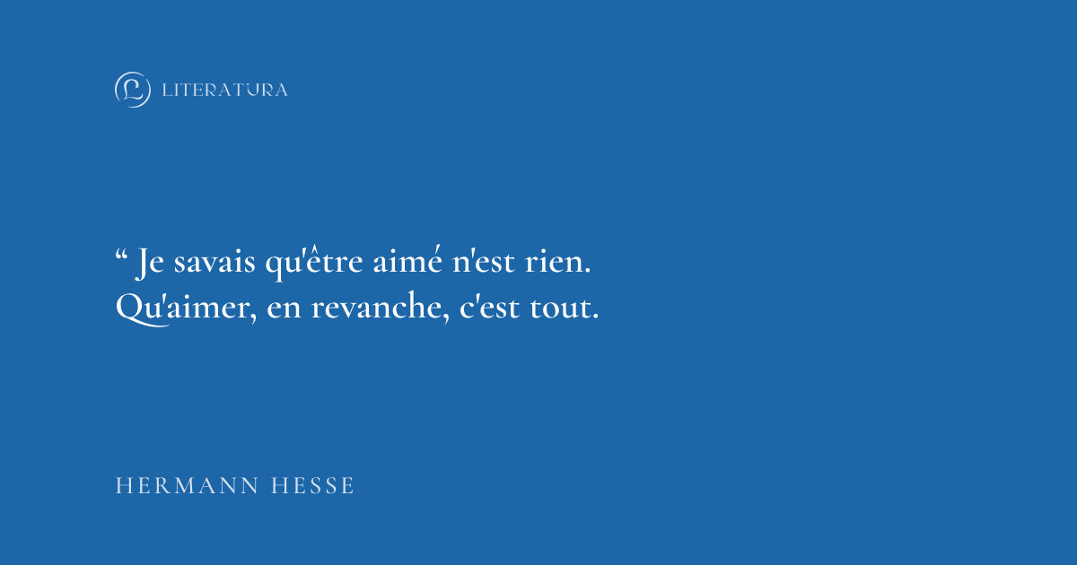
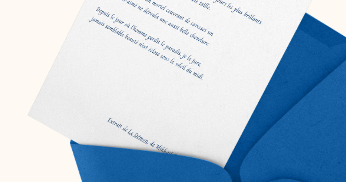
Literatura is a project aimed at compiling excerpts from the greatest classical authors in about thirty small colorful envelopes to be given to a loved one. The compilation is meant to be enjoyed at the pace of one envelope per day, like an advent calendar. These excerpts mainly deal with themes that have a central poetic dimension, thus creating genuine quotes about love.
- #Illustrator
- #Photoshop
- #Branding
- #Consulting
- #Logo
- #Typography
- #Colors
- #Individual work
Context
This visual identity was created for a young Russian client studying in Paris, with a passion for classical literature. In relation to his situation, this project is not part of a business strategy but rather a home-made creative endeavor: the letters are custom-made and then packaged at home, with limited resources.
Target Audience
Literatura primarily targets French couples aged 18 to 30 who are passionate about literature. However, it can also attract followers from broader age groups, as love touches everyone, even those who may not share the same literary passion. Indeed, a simple sensitivity to love in its romantic and profound expression can be enough to spark interest in the project.
Issues and Constraints
The main challenge of this project was to create a visual identity that was both classic and modern, while also simple enough for the client to easily use. There were three main tasks: creating a logo, defining colors, and choosing typography. Additionally, several constraints were imposed, including some prerequisites from the client:
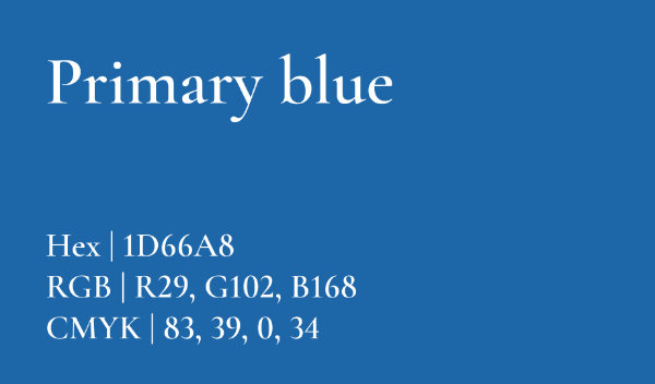
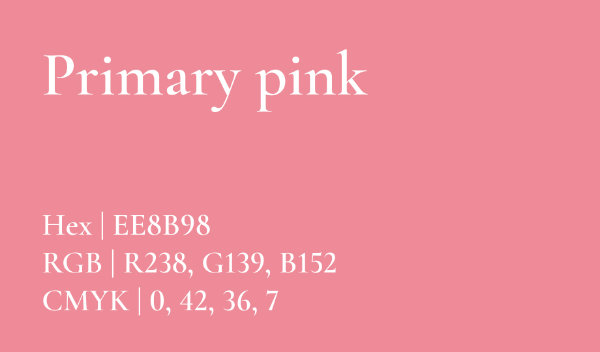
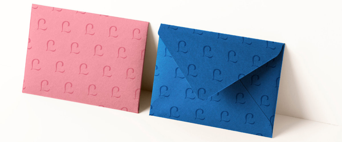
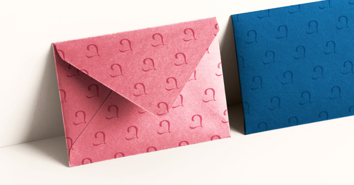
- The identity had to feature two main colors: blue and pink.
- The font used in the letters had to be handwritten to give the aesthetic of a letter written by hand.
- The deadline was set at two weeks.
Research Phase
Moodboard and Inspirations
My work began with a research phase. I tried to immerse myself in the literary and romantic world by searching for and collecting images, fonts, colors, and even other visual identities associated with it.
Thus, I determined that the visual identity of Literatura should lean toward something refined and elegant, with inspirations that are both classic, in line with literary tradition, and modern, appealing to a younger audience, while also embodying the passion of love.
My Working Method
Once my research was completed, I first focused on creating the logo, followed by choosing the fonts and then defining the colors. This specific order allows me to concentrate on designing the symbol first, and then let the typography complement it; ideally, the typography should conform to the style of the symbol, not the other way around.
Until this point, my creative process was carried out without colors in order to prioritize the silhouette and form contrast, optimizing its readability. Defining a precise color palette came later.
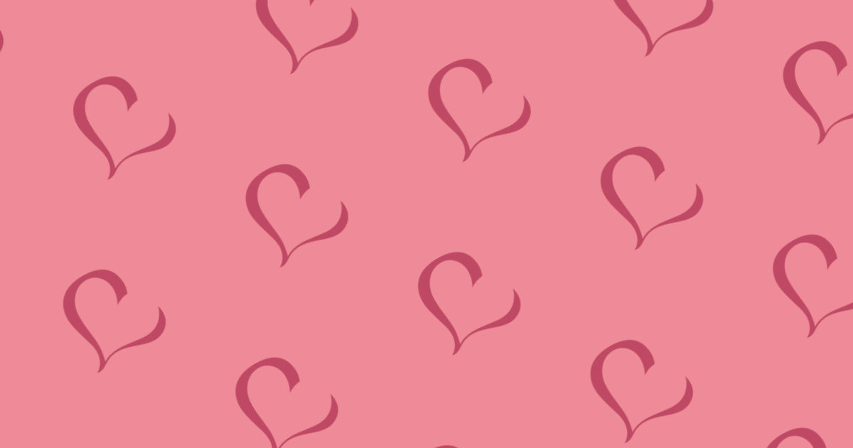
The Logo
Shape Research
I started my logo research by sketching several ideas on paper: I was looking for shapes that could relate to letters, literature, culture, and love. Among these shapes, I explored the possibility of using symbols like an envelope, a feather, paper, etc.
Final Concept
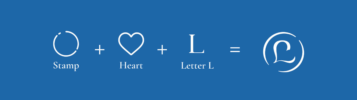
Ultimately, it was the combination of three shapes/symbols that captured my attention:
- The letter "L," which references the name of the project, literature, and writing in general.
- The heart, an essential and universal symbol of love.
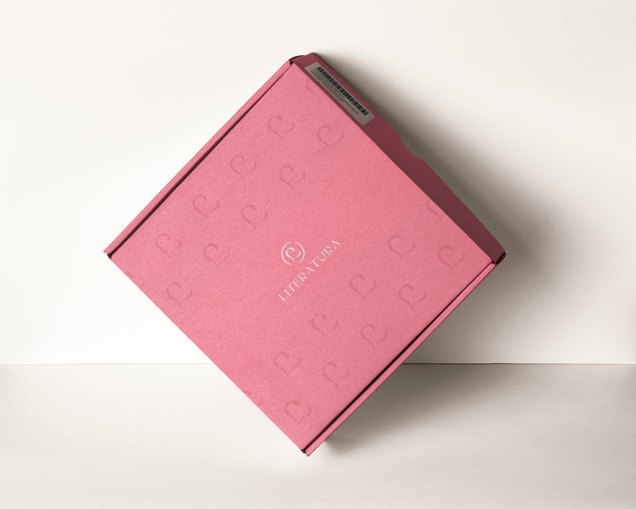
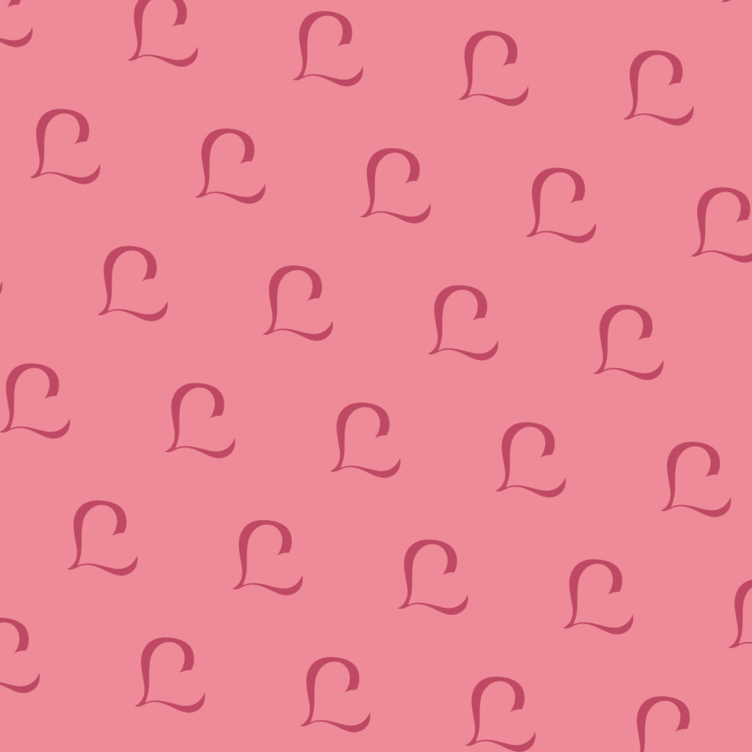
- The seal, a very interesting symbol for its relation to craftsmanship and its hand-made, personalized nature, reminiscent of letters originally sealed with wax.
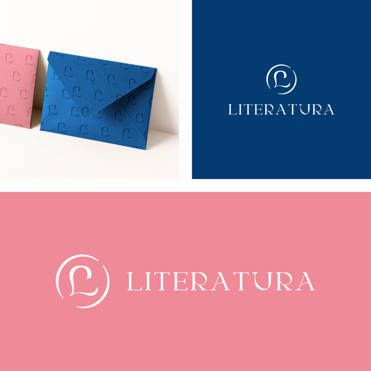
The subtle heart is formed through the negative space created by the letter "L." This letter resembles a capital letter in a certain calligraphic style, evoking handwriting and thus literature in a traditional, classical spirit. Finally, the seal is represented by the circle surrounding the symbol.
Typography
My typographic research was carried out with the client's requirement in mind: a handwritten font for the letters. Since this type of typography is not very readable and is typically used in display contexts, I decided to narrow down the options by selecting three fonts: one for the logo and titles, one for all the body text outside of the letters, and a specific handwritten font for the letters themselves.
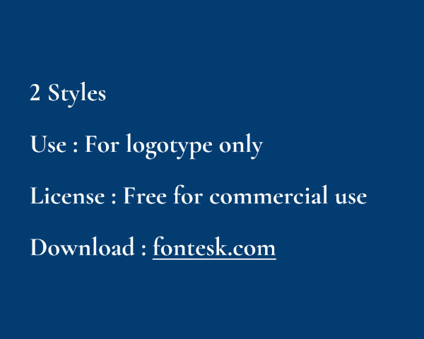
Additionally, my choices were made based on aesthetic criteria, but also considering technical constraints. I ensured a variety of styles to allow flexibility in future adaptations of the visual identity, checked the type of license to guarantee legal usage, and made sure the fonts were free, as the client has a limited budget.
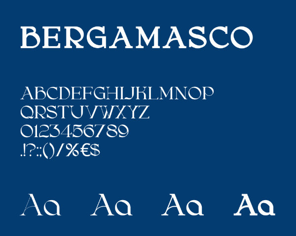
Logo and Titles
After comparing about twenty different fonts based on the criteria mentioned earlier, Bergamasco turned out to be the most aligned with the visual identity I was aiming to create. It has an elegant and modern touch with a certain contrast that complements the logo perfectly, enhancing its intended message.
Body Text
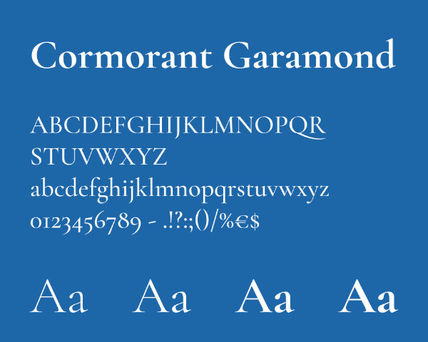
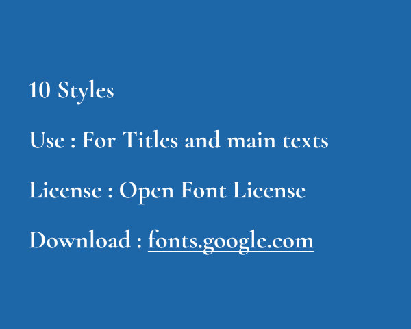
Cormorand Garamond stands out primarily for its soft yet strong contrasts, combined with its characteristic serifs. Part of the large Garamond font family, it strongly evokes the typography used in book printing, thus conveying a classic literary dimension. It is therefore perfect for body text.
The letters
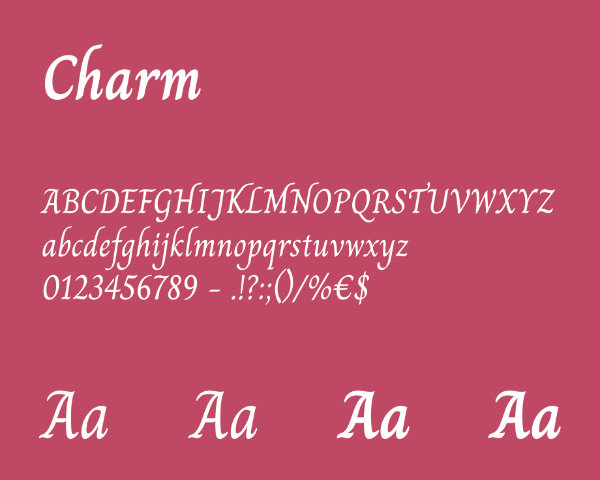
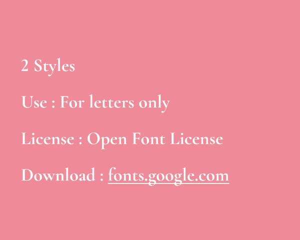
Among many possibilities, I chose Charm to offer a balance between a handwritten font and the need for readability. With its non-connected letters, it stands out by making reading easier, while still maintaining the hand-written look requested by the client and its romantic feel.
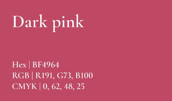
Colors
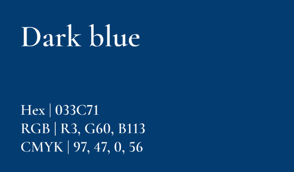
Although it was a client requirement, the choice to combine blue and pink aligns perfectly with the project. Pink brings a sense of romance and seduction without being excessive, conveying tenderness and a feeling of youth, while blue adds a sense of serenity, loyalty, and wisdom to the project. These are all aspects that perfectly describe Literatura!
Make It Pop!
As far as my work was concerned, I simply influenced the choice of shades of these colors to best match the desired mood. Originally, the colors as defined by the client were dull, the exact opposite of the romantic, youthful, passionate look I was seeking for this visual identity.
A More Contrasting Palette
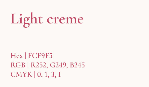
Finally, to offer a more complete color palette, but also to comply with accessibility standards, particularly in terms of contrast, I declined the main colors in more nuanced versions. The aim was to achieve at least the AA or even AAA contrast standard.
Some Visuals
Product Mockup
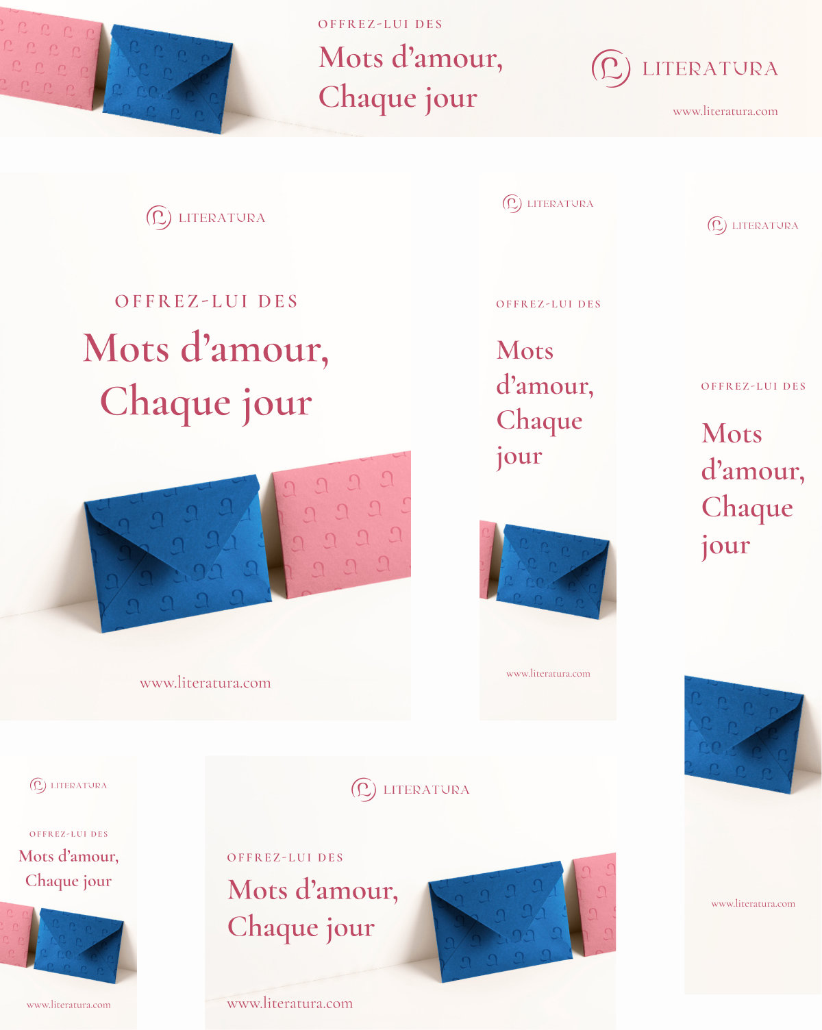
Responsive Web Banners
Retrospective
Overall, I'm very pleased with the final result. The visual identity meets the needs of the customer, who was also very satisfied. I can, however, make a few suggestions that would have been interesting to explore further during its development.
Firstly, the duality of the blue and pink colors is very aesthetic, it's true, but they also symbolize a stereotyped, non-inclusive vision of love as a male-female opposition. This vision is widely questioned in the West, but remains the majority view in some countries, notably Russia, which is less affected by issues of gender equality or sexual emancipation.
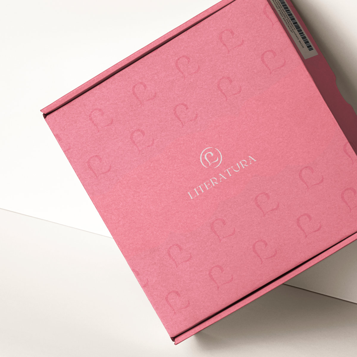
Secondly, instead of just delivering a logo, I guided the client towards a visual identity. I think I should also have proposed a packaging design, since the aesthetics of the product are an important part of its appeal.
Thirdly, I should also have had a stronger influence on the choice of handwritten typography, which results in a loss of legibility. In the image of Cormorant Garamond, the typography of the letters could have been closer to classical printing, thus in line with the desired aesthetic and the need for legibility.
And fourthly, I could have tested a thicker version of the logo. This would have enhanced its contrast, making it more legible on a small scale, while accentuating its symbolic depiction of passionate love, which would be perfectly illustrated in a bolder typeface.