Medica2025, Visual Identity and Mobile Interfaces
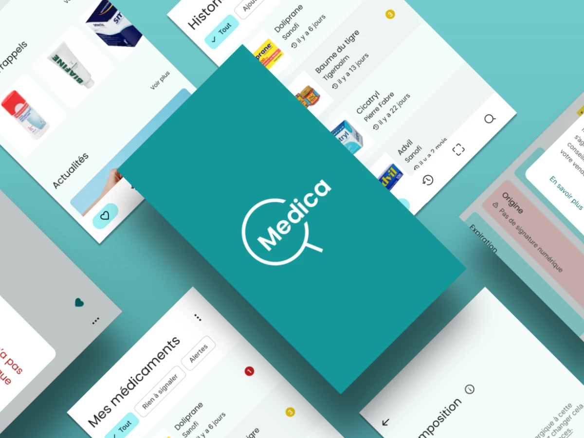
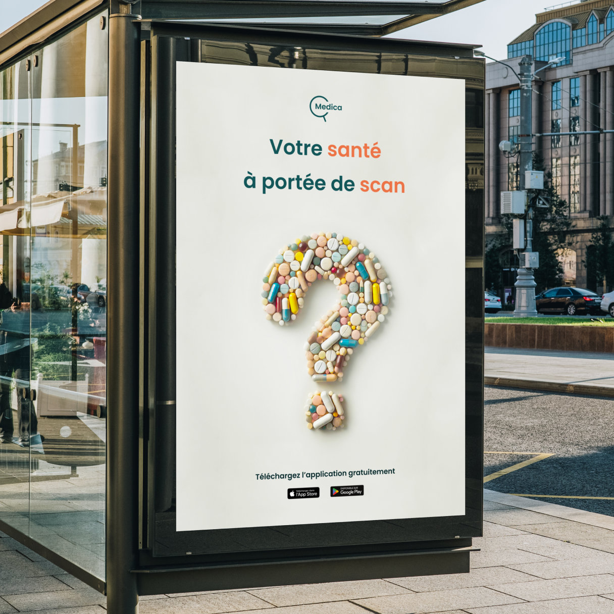
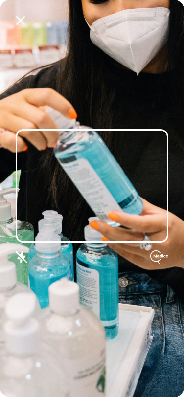
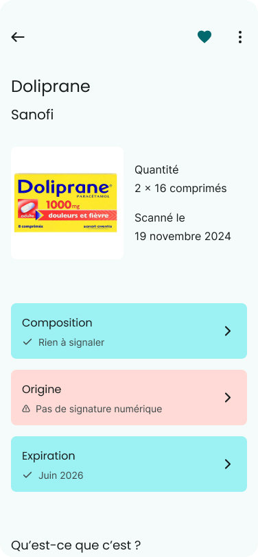
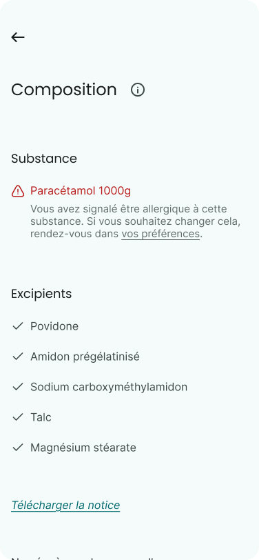
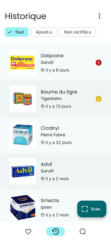
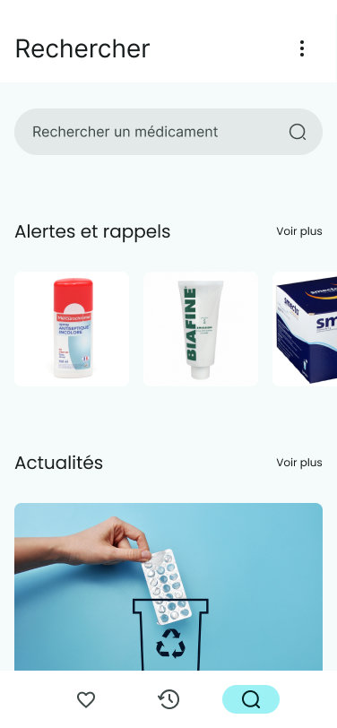
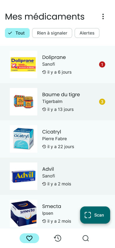
Medica is a fictional mobile application fighting against drug adulteration using Blockchain technology. Thanks to a system of tokens (NFT), each drug is traced, ensuring its tracking from laboratory to consumption. The medication can be scanned at any time to verify its authenticity through the app. The visuals presented on this page are reworked versions of 2022.
- #Illustrator
- #Figma
- #Branding
- #Logo
- #Typography
- #Colors
- #Team work
- #Fictional project
Context
This project was originally carried out in a team of 4 people in 2022 as part of the Master's degree in Digital Creation and Publishing at the University of Paris 8 during a hackathon at the PosteSource, the university's Digital Center for Social Innovation (CNIS).
The imposed theme was Blockchain technology applied to the Social Solidarity Economy (SSE). We came up with the concept of drug traceability. I reworked the whole visual part in January 2025.
Research Phase
Drug Falsification
What is falsification? According to the World Health Organization (WHO), “A counterfeit medicine is one that is deliberately and fraudulently provided with a label that does not indicate its true identity and/or source."
"It may be a speciality or a generic product and, among counterfeit products, there are some that contain the right ingredients or the wrong ingredients, or no active ingredient, and there are others where the active ingredient is in insufficient quantity or whose packaging has been falsified.”
What Are The Consequences?
It is estimated that around 10% of the world's medicines are counterfeit. In 2013, for example, falsified malaria treatments caused 150,000 deaths in children under the age of 5. In the case of malaria and tuberculosis, falsified medicines alone cause 700,000 deaths every year.
This scourge mainly affects Latin America, South-East Asia and Africa, with falsified medicines mainly manufactured in China and India. According to the Institute for Research into Drug Counterfeiting (IRACM), it is ten to twenty times more profitable than drug trafficking.
The Origin Of The Name Medica
As an international project, its theme had to be comprehensible to everyone and in several languages. After a long brainstorming session, the name Medica seemed the most effective: in a multitude of European languages, the word medicine includes the root “med”.
This is an important aspect for the areas most affected by falsification, notably Latin America and Africa, which are strongly influenced by European languages. Only Asia remains a linguistic exception, too specific to be included in a common name.
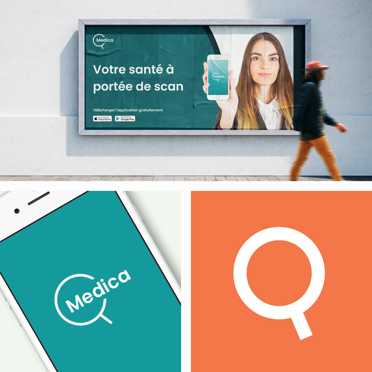
Visual Identity
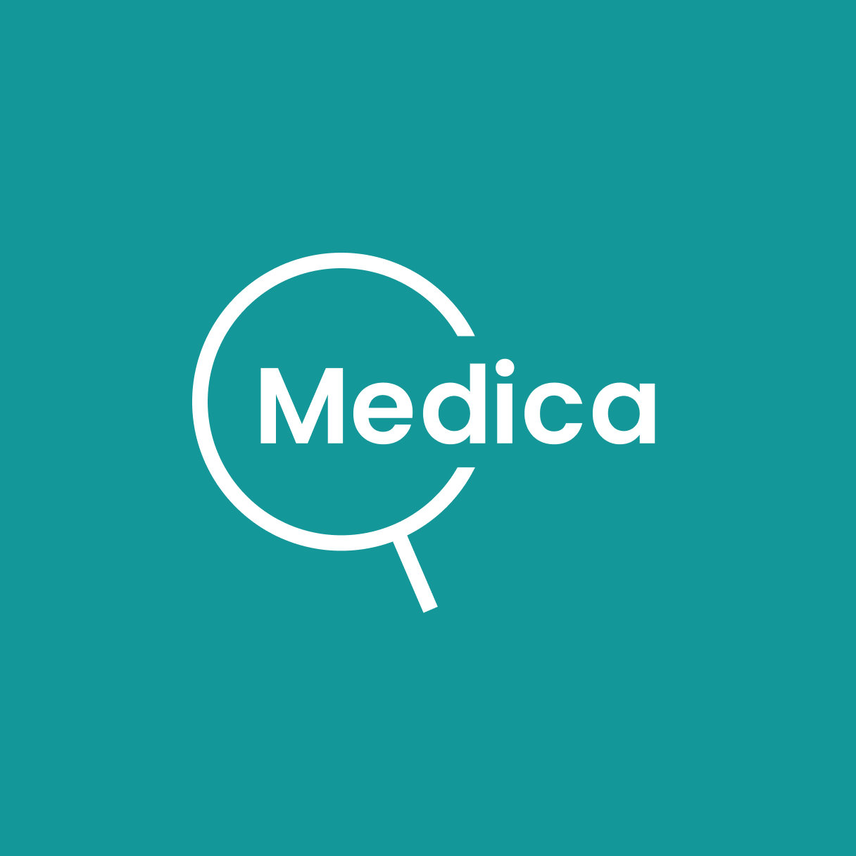
The Logo
The magnifying glass symbolizes research and detailed examination. Superimposing it on the root “med” in the name Medica creates a meaningful association: highlighting the drug's origin and what it actually contains.
The handle is inclined at 23.26°, corresponding to the average inclination of the Earth's axis of rotation and symbolizing the international scope of the project. This symbol is all the more magnificent for its subtlety.
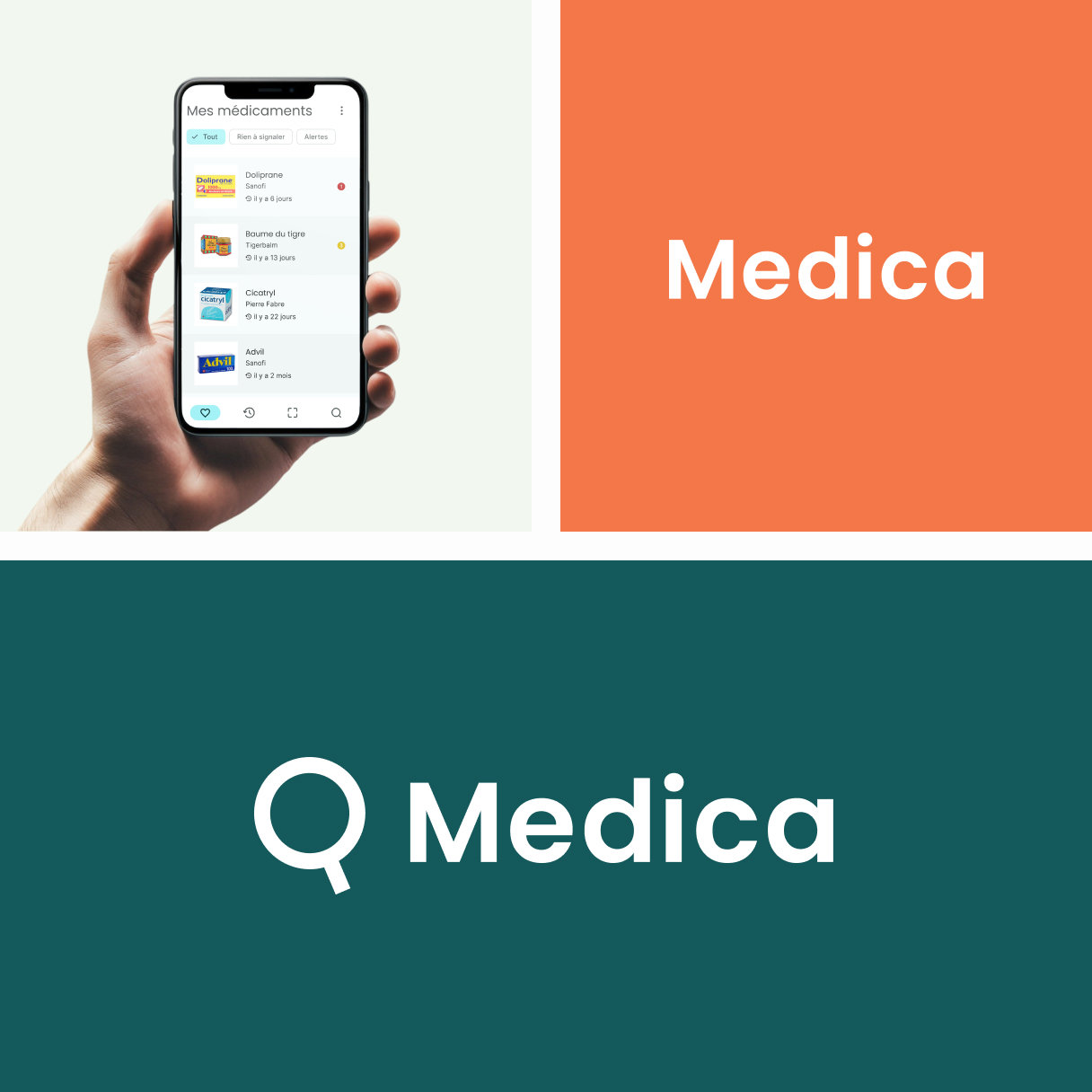
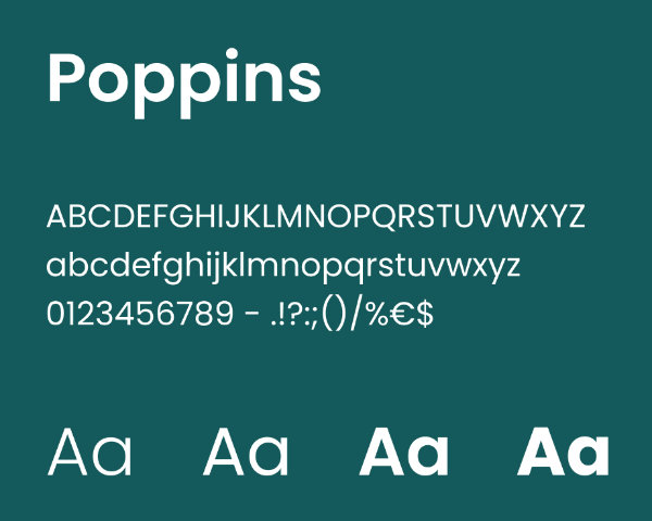
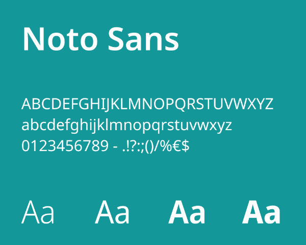
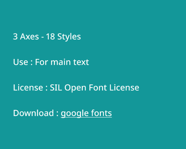
The Typography
We chose Poppins for its rounded, geometric shapes, which match the logo, its friendly character and its modernity. In contrast, Noto Sans has more dynamic, open shapes in keeping with the humanitarian dimension of the project. Both typefaces can be adapted in several languages.
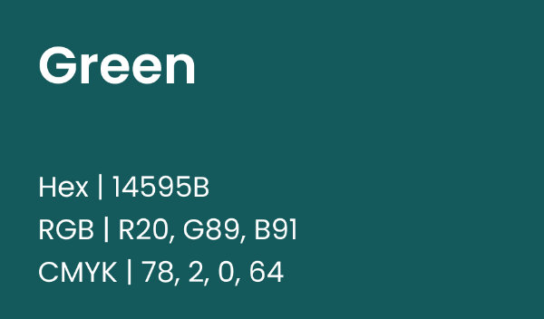
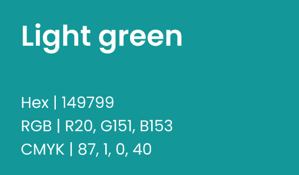
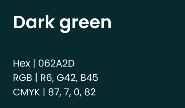
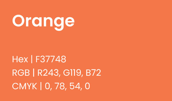
The Color Palette
Medica's initial color scheme was a highly saturated green, similar to that of a pharmacy. But this type of very aggressive color was not representative of the aspects of safety, security and trust that the project was intended to convey. That's why I adapted the green, making it softer and pushing it slightly towards blue.
Blue is often associated with reliability, while green in some of its shades is associated with serenity. Orange serves as an accent color and symbolizes alertness.
Mobile App
Retrospective
Medica is a fabulous project, both in concept and in the visuals used to illustrate it. But it does have a few negative points to note.
Firstly, I have serious doubts about the project's feasibility; at the time of its development, we were more focused on the subject of forgery and the production of visuals than on defining a viable business model. So there are still a few points to be worked out.
Secondly, I have my doubts about the logo. Even if the superimposition of the magnifying glass and the word “Med” remains a strong symbol, the magnifying glass can be confusing. It connotes above all the research aspect, but not enough the safety aspect. It also throws the logo off balance, with its predominance on the left and its handle at the bottom.